8 Linear Regression - Application
After we have learned the ins and outs of linear regression we will now return to our NBA data. We already saw, that there was an interesting relationship between the points a player makes per game and the salary he receives in session 2. In session 4 we also built a DAG that reflects our assumptions about the data generating process. Based on the DAGs implications we can now build a linear regression model and try to estimate the effect of interest as accurately as possible.
8.1 Objectives
- Estimate the effect of interest, scored point on salary, using a linear regression
- Applying diagnostics to the model and correct mistakes
- Interpret the final model
8.2 R functions covered this week
lm(): Fits a linear regression model. It takes a regression formula and the data to be modelled on. It returns a model object that is used by the functions below.- Displaying regression results
summary(): Base R function for summaries on different kinds of objects. Used on a linear regression model object, information on the coefficients and associated measures, the model fit as well as on the distribution of residuals is returned.tidy()&glance(): Functions from broom package. They return model information as tibbles. The former returns the coefficients and associated measures, the latter the model fit.
- Regression diagnostics
plot(): Base R function for plotting. Used an a model object, plots used in regression diagnostics are returned.autoplot(): From the ggfortify package. Returns the same plots on regression diagonstics, but in the style of ggplot2.vif(): From the car package. Used on a model object, it returns the variance inflation factors (VIF) used in regression diagnostics.
log()&exp(): Base R functions. The former computes the logarithmus naturalis of a variable, the latter the exponential function. Both can be used in transforming skewed variables or in reversing each others transformations.I(): Base R function. Used in a regression formula it indicates that an expression should be evaluated as is, instead of in the formula syntax. Can for example be used to square a variable in a regression formula.
8.3 Research question
Picking up from session 2 & 4, our research question is still to get an unbiased estimate for the effect from points scored on the salary a NBA player receives. We already constructed a DAG that reflects our assumptions for the underlying data generating process. Let us revisit this briefly:
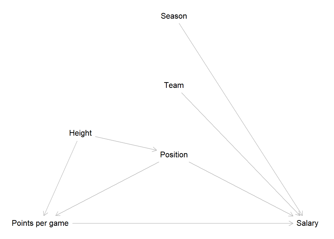
The implications of our DAG were that we only have to control for the position a player occupies to get an unbiased estimate for our effect of interest. The path that passes the body height is already closed by controlling for position and the team a player plays for as well as the season an observation was recorded in do not lie on an paths from our main independent to our dependent variable. Based on this we construct our model.
Now let us get to it and load the NBA data we prepared in week 2.
8.4 Simple linear regression in R
To conduct a multiple linear regression in R, we can use the built-in
base R function lm(), short for linear model. The function is
straightforward to use. As the first argument we write the regression
formula in R’s formula syntax.
We start building the formula by writing the name of our
dependent_variable followed by a tilde ~. You can read this as an
\(=\) or as “regress the dependent variable on”. After the tilde we add
our first indepedent variable by again writing out its name. If we
have multiple independent variables in our model - when we are running a
multiple linear regression - we can add those by writing a +
followed by the name of the variable to be added.
As an additional argument, the function needs the name of the object that holds our data.
The goal of our research question is to estimate the effect of the
points per game on the received salary. So to regress salary on
career_PTS, we just write:
##
## Call:
## lm(formula = salary ~ career_PTS, data = data_nba)
##
## Coefficients:
## (Intercept)   career_PTS
##     -851914       552843
This gives us a short output. The first line just echoes our code used to run the regression. We have seen this in the last session already, but now we know what the meaning was. After this we have a short block with the estimated coefficients. As we have run a simple linear regression, we only get the intercept and the coefficient for the sole independent variable used in the model. If we would have run a multiple linear regression, the result would basically look the same, only with more coefficients to display.
Before we dive into the results, we should talk about how to receive a more verbose output that does not hide all the other vital information that is associated with the model.
The easiest way is to use the base R function summary(). This is a
generic R function that returns different summaries, depending on the
object it is used on. We can for example use it on a data frame or
tibble to get some descriptive statistics for the included variables.
For example, we can get information on the distribution of points per
game by writing:
##    Min. 1st Qu.  Median    Mean 3rd Qu.    Max.
##   0.000   5.100   8.000   8.908  12.000  30.100
When we use summary() on a model object, like the one created by
lm(), we get a different output. Before we apply this we should save
our model in an object. This is good practice in most cases, as we can
now apply all additional analysis of the model on this object and we do
not have to rerun the model every time.
We can now apply summary() on the object m1, short for “model 1”:
##
## Call:
## lm(formula = salary ~ career_PTS, data = data_nba)
##
## Residuals:
##       Min        1Q    Median        3Q       Max
## -14788659  -2023969   -434599   1311807  24326060
##
## Coefficients:
##             Estimate Std. Error t value Pr(>|t|)
## (Intercept)  -851915      76417  -11.15   <2e-16 ***
## career_PTS    552843       7453   74.17   <2e-16 ***
## ---
## Signif. codes:  0 '***' 0.001 '**' 0.01 '*' 0.05 '.' 0.1 ' ' 1
##
## Residual standard error: 3732000 on 9726 degrees of freedom
## Multiple R-squared:  0.3613, Adjusted R-squared:  0.3612
## F-statistic:  5502 on 1 and 9726 DF,  p-value: < 2.2e-16
This is the output we saw over the last weeks and it includes an extended and better readable coefficient block as well as the information on the residuals and the model fit.
An alternative method of displaying the coefficients in a regular tibble
format is to use tidy() from the broom package.
## # A tibble: 2 × 5
##   term        estimate std.error statistic  p.value
##   <chr>          <dbl>     <dbl>     <dbl>    <dbl>
## 1 (Intercept) -851914.    76417.     -11.1 1.09e-28
## 2 career_PTS   552843.     7453.      74.2 0
8.4.1 Interpretation
While we know our model is not complete yet, let us still inspect the
results. For each point a player scores per game, his salary rises by
about \(552,000\$\). We see a clear positive and substantial effect. Let
us also inspect the intercept. This tells us that a player who makes no
points per game has to pay the team about \(850,000\). Wait, this does not
make sense… To make the intercept more readily interpretable we should
again center our metric dependent variable career_PTS on its mean.
## [1] 8.907679As we have now centered the independent variable of interest on its mean of \(8.9\) we can rerun the model.
##
## Call:
## lm(formula = salary ~ PTS_centered, data = data_nba)
##
## Residuals:
##       Min        1Q    Median        3Q       Max
## -14788659  -2023969   -434599   1311807  24326060
##
## Coefficients:
##              Estimate Std. Error t value Pr(>|t|)
## (Intercept)   4072633      37840  107.63   <2e-16 ***
## PTS_centered   552843       7453   74.17   <2e-16 ***
## ---
## Signif. codes:  0 '***' 0.001 '**' 0.01 '*' 0.05 '.' 0.1 ' ' 1
##
## Residual standard error: 3732000 on 9726 degrees of freedom
## Multiple R-squared:  0.3613, Adjusted R-squared:  0.3612
## F-statistic:  5502 on 1 and 9726 DF,  p-value: < 2.2e-16
The coefficient for points per game has not changed but its interpretation has. For each point per game over the mean of \(8.9\) points per game, the salary is estimated to increase by about \(552,000\$\). At the same time, for each point below the mean the salary is estimated to decrease by the same amount. The intercept now shows us the estimated salary of a player who scores \(8.9\) points per game, which is slightly upwards of \(4,000,000\$\). This makes way more sense.
This model model already achieved a considerable \(R^2\) of \(0.36\). About \(36\%\) of the variance in salaries is explained by points per game.
Another way to get the model statistics, such as \(r^2\), F-statistic, and
p-value, is to use the glance() function from the broom package. This
function returns a tibble with one row of model summaries.
## # A tibble: 1 × 12
##   r.squared adj.r.squared    sigma statistic p.value    df  logLik    AIC    BIC
##       <dbl>         <dbl>    <dbl>     <dbl>   <dbl> <dbl>   <dbl>  <dbl>  <dbl>
## 1     0.361         0.361 3732168.     5502.       0     1 -1.61e5 3.22e5 3.22e5
## # ℹ 3 more variables: deviance <dbl>, df.residual <int>, nobs <int>
We can see that the output includes the same information as the summary
of m1, but in a different format. The advantage of using glance() is
that it is easier to manipulate and compare the model statistics using
tidyverse functions. For example, we can use bind_rows() to combine
the outputs of different models and compare their performance.
8.5 Multiple linear regression in R
The DAG we have constructed above based on our research question
indicated that we also have to include the position a player occupies in
our model. We can add additional independent variables to the formula
used in lm() with a + and the name of the additional variable(s).
This works the same way for all types of variables, i.e. metric, dummies
or categorical variables. So let us do this now by adding the 5 dummies
we constructed for the positions:
m2 <- lm(salary ~ PTS_centered + position_center + position_sf +  position_pf + position_sg + position_pg, data = data_nba)

summary(m2)
##
## Call:
## lm(formula = salary ~ PTS_centered + position_center + position_sf +
## position_pf + position_sg + position_pg, data = data_nba)
##
## Residuals:
## Min 1Q Median 3Q Max
## -14511723 -1950255 -372906 1358768 24433660
##
## Coefficients:
## Estimate Std. Error t value Pr(>|t|)
## (Intercept) 3679728 114300 32.193 < 2e-16 ***
## PTS_centered 568019 7474 75.994 < 2e-16 ***
## position_center 1380246 114539 12.050 < 2e-16 ***
## position_sf 125384 102174 1.227 0.219790
## position_pf 206505 94882 2.176 0.029547 *
## position_sg -331033 96841 -3.418 0.000633 ***
## position_pg -114552 117486 -0.975 0.329572
## ---
## Signif. codes: 0 '***' 0.001 '**' 0.01 '*' 0.05 '.' 0.1 ' ' 1
##
## Residual standard error: 3652000 on 9721 degrees of freedom
## Multiple R-squared: 0.3888, Adjusted R-squared: 0.3884
## F-statistic: 1031 on 6 and 9721 DF, p-value: < 2.2e-168.5.1 Interpretation
We still see a clear positive effect of points per game on the received salary after controlling for the position a player occupies. Among those centers are by far the top earners, making about \(1,400,00\$\) more than players on other positions. Most other positions show relatively small effects on the earnings. Power and small forwards earn somewhat more than other positions on average while point and especially shooting guards earn less.
We can now compare two fictive cases of a center and a point guard who each make about \(20\) points per game. What is the estimated salary for them?
As we have extensively worked with the formulas over the last sessions, we can now keep it short and calculate the estimate directly. Remember that we centered the points per game on the mean of about \(8.9\), so making \(20\) per game would mean scoring about \(11.1\) more compared to the average player. We will keep it simple here and calculate with \(11\).
\[\hat{y_{center\_20}} = 3679728 + 568019 * 11 + 1380246 = 11,308,183\]
\[\hat{y_{pg\_20}} = 3679728 + 568019 * 11 - 114552 = 9,813,385\]
Despite making the same amount of points per game for their team, the model estimates that a point guard earns about \(1,500,000\$\) less compared to a center.
8.5.2 Sidenote: Adding interactions
We will not use interactions in this session but we briefly want to state how we could add them in the formula syntax.
Remember that interactions are multiplicative terms in our regression
formula. Adding them to the R formula syntax works the same way. We add
the new term with a + and use a * between the two variables that we
want to interact.
Here is a non running toy example where we interact two x-variables:
lm(y ~ x1 + x2 + x1 * x2, data = some_data)8.6 Regression Diagnostics
So how does our model perform? Did we meet all the regression assumptions that were introduced last week?
To access the visual tests we used last session, we can just use the
base R function plot(), applied to the model object. If we write
plot(m2), the console asks us to press ENTER to go through each plot
one by one. We can also add a number as a second argument, specifying
which plot we want to see. For example, plot(m2, 1) gives us the
residuals vs. fitted plot.
But there is an easier way to see all four plots at once. The package
ggfortify expands the functionalities of ggplot2 so that we can use
it’s autoplot() function to automatically plot all four visual tests
of interest. An added benefit, depending on your taste, is that the
plots are rendered in the style of ggplot2.
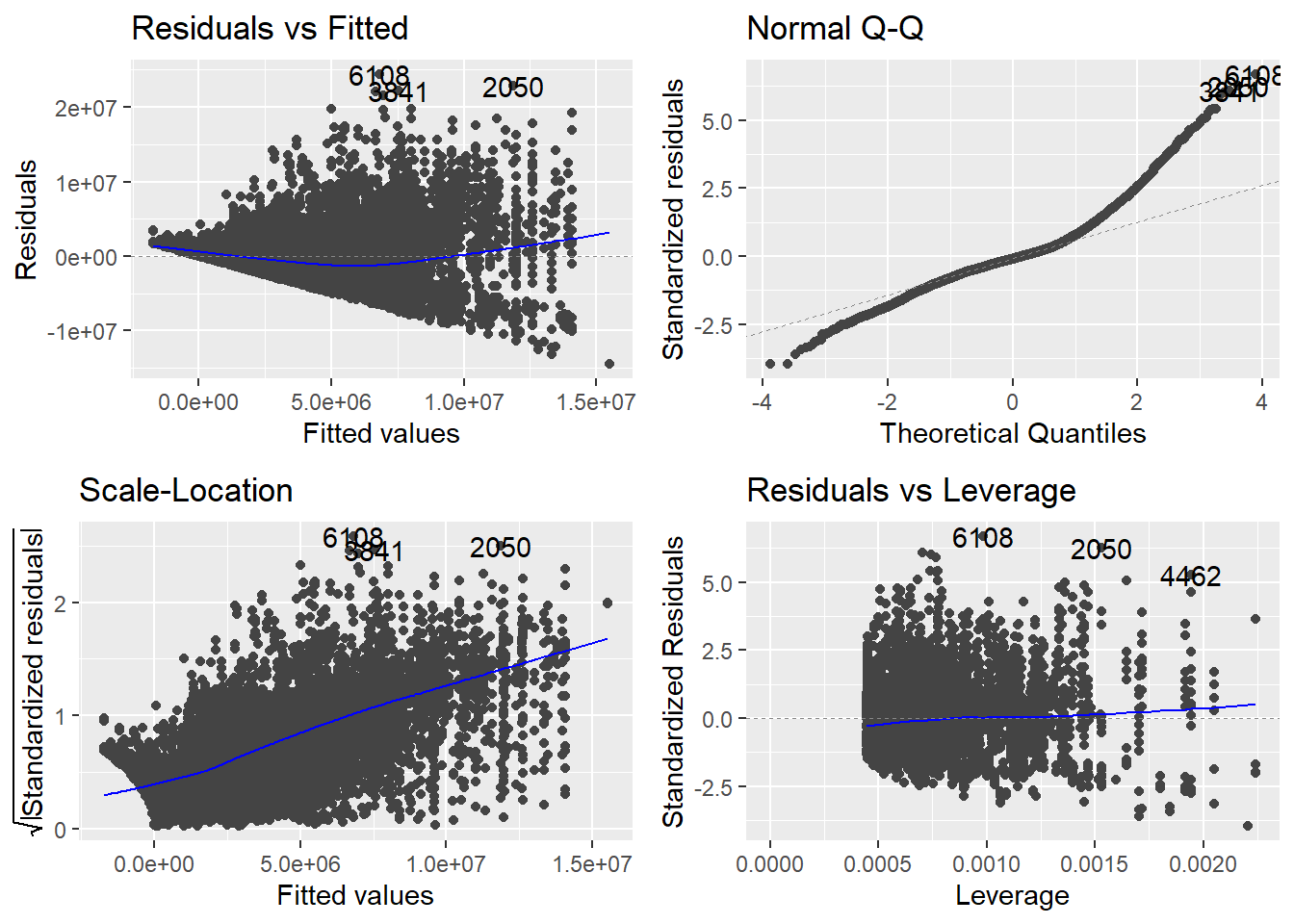
The residuals vs. fitted does not show us a more or less straight line but starts mildly positive, then dips below \(0\) and rises again for higher estimated salaries. This could indicate at least two thing. Either we have missed an important independent variable, like in the last session, or we are actually dealing with some amount on non-linearity. If it is non-linearity, it is still mild non-linearity, but maybe we should still inspect this.
The Q-Q plot this time shows that the actual residuals are far from being distributed normally. While we can never expect a perfectly normal distribution, here the deviations are striking, especially for high residuals.
The scale-location plot is used to address the assumption of homoscedasticity. What we want to see, is a straight line with data points equally distributed around it. This clearly is not the case here. As it is, the plot indicates that we may be able to estimate small salaries reasonably well but that the higher the estimate, the more unreliable our model gets.
The residuals vs. leverage plot also indicates some problems. There are some observations that have larger or smaller standardized residuals compared to the thresholds of \(3\) and \(-3\). The threshold for leverage is computed as \(2 * (6 + 1) / 9728 = 0.001439145\). We also see some observations with higher values. While both are rules of thumb and may not necessarily point to severe problems by themselves, things can get problematic when there are observations that do not meet the thresholds for both measures at the same time. This is indicated by clusters in the lower or upper right corners. This time we can observe this in the lower right.
We should also test for multicollinearity. We can compute the VIF
measures using a function from the package car.
##    PTS_centered position_center     position_sf     position_pf     position_sg
##        1.050400        2.035722        1.686736        1.512765        1.565004
##     position_pg
##        1.916933
The values for any variable should not exceed \(5\) and should be closer to \(1\). Our value for points shows no signs of multicollinearity. The values for the position dummies have somewhat higher values, which makes sense. While there are some players that play multiple positions, for most a value of \(1\) on one position predicts the other positions as having a value of \(0\). But as we are still far away from the threshold of \(5\), there is no need for concern here.
Overall, we have problems! While we do not see signs of problematic multicollinearity, all other tests indicated clear and in parts severe problems. We have to put in some more work before we can be confident that our model accurately estimates the effect of points per game on the received salary.
Before we start addressing the problems, we should note that the four plots are highly interactive. It is entirely possible that solving one of the problems also solves the others or, for added fun, even generates new ones. This means that we should refrain from turning too many dials at once and rather change the model one step at a time, see if it improves things and then address remaining problems in the same way.
8.6.1 Skewed outcome variable
The deviation from normality and the clearly present heteroscedasticity could both point to the same problem, namely a skewed dependent variable. Let us examine its distribution first.
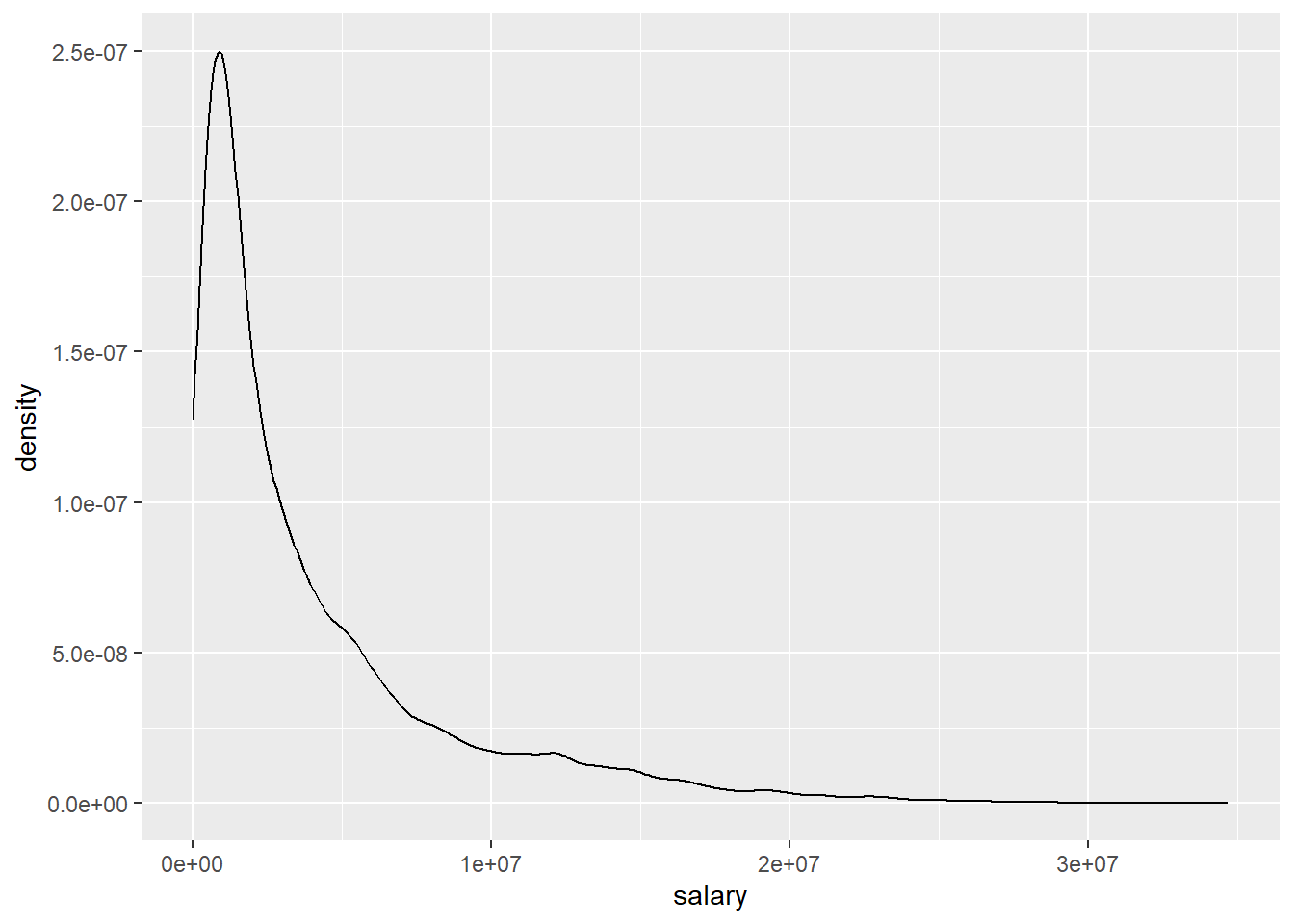
Our outcome variable is not only skewed, it is highly skewed. While there are many salaries in the “lower” six to seven digits regions, we also see some extremely high wages up to about \(35,000,000\$\). The higher the salary the fewer observations we have. That is why we see such a long flat tail to the right.
This distribution actually is relatively common for income data. In most surveys of the general population we have many people receiving relatively low incomes while fewer individuals receive higher or extremely high incomes. It is still interesting that this also holds true for a population of high earners such as NBA players. Inequality is relative. Compared to the general population almost all our players would be somewhere in the long tail to the right. Compared to their own population we still see highly substantial differences in outcomes.
We can transform the dependent variable to a different scale to get a
less skewed distribution. A common transformation for income data is to
take the logarithmus naturalis of the actual value and then use this
as our dependent variable. To achieve the transformation we can simply
use the base R function log() which as its default computes the \(ln\).
data_nba <- data_nba %>%
  mutate(salary_log = log(salary))

data_nba %>%
  ggplot(aes(x = salary_log)) +
geom_density()![]()
While the distribution of the transformed variable also is somewhat skewed, now to the left, overall it is much more evenly distributed.
We should use the new variable as our outcome an check the tests again.
m3 <- lm(salary_log ~ PTS_centered + position_center + position_sf +  position_pf + position_sg + position_pg, data = data_nba)

autoplot(m3)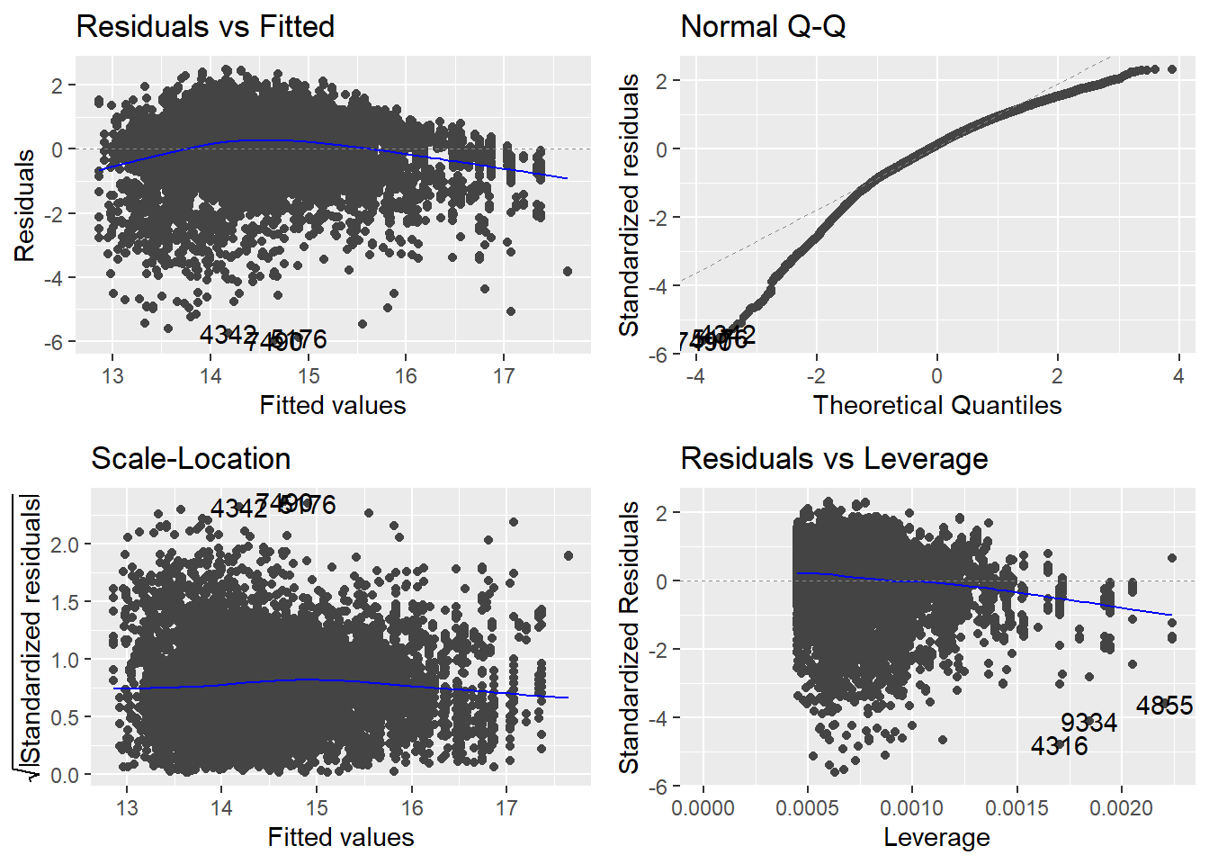
Looking at the scale-location plot first, we can now see a straight line with our residuals fairly evenly distributed around it. Thus we now longer see any signs of heteroscedasticity. The Q-Q plot now also indicates a somewhat more normal distribution of our residuals but there are substantial deviations still. While high residuals now appear to more or less follow the normal distribution, small residuals now deviate stronger than they have before. This reflects the transformation and its distribution, which now has long tail on the left instead of on the right, as before. Turning to the residuals vs. leverage plot we still see some observations that do not meet the respective thresholds. At the same time, there appear to be less that simultaneously have high absolute standardized residuals and high leverage. The residuals vs. fitted plot now also shows a more even distribution while the signs on non-linearity remain. We do not have to recompute the VIF measure as we did not change any independent variables in the model.
8.6.2 Non-linearity
Let us now address the non-linearity that is still indicated in the first plot. We can approach non-linear relationships in our inherently linear model by adding non-linear transformations of a dependent variable to the model. But before we start squaring random variables, we should think about what could be non-linear in our case. We can rule out our dummy variables for position. This leaves the points scored. The model already indicates that our suspicion that salary rises with the points scored could be true. But maybe this relationship is not linear over its whole range. If you already are among high scorers, scoring one or two points more than your peers may not be such a substantial difference and thus may not have the same strong effect on salary.
We should first inspect the relationship between both variables again.
This time we add a LOWESS curve to the plot. This is often helpful in
detecting non-linearity as the curve can change its slope over the range
of the dependent variable. This is also the default for geom_smooth().
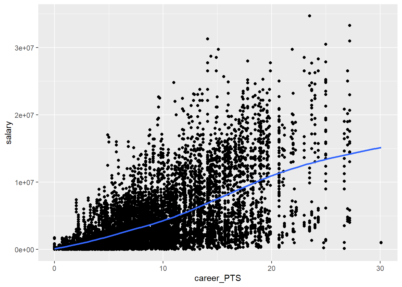
While this is not as clear as we hoped, the line may still indicate some mild non-linearity as it flattens somewhat for really high point values. Also we have to keep in mind that the non-linearity may be stronger when we control for additional variables, as our position dummies.
One common way to address the non-linearity is taking the square of the dependent variable in question. We should not square our centered points variable though. Let us inspect what would happen if we squared it.
data_nba %>%
  ggplot(aes(x = PTS_centered, y = PTS_centered ^ 2)) +
  geom_point() +
  geom_smooth(se = FALSE)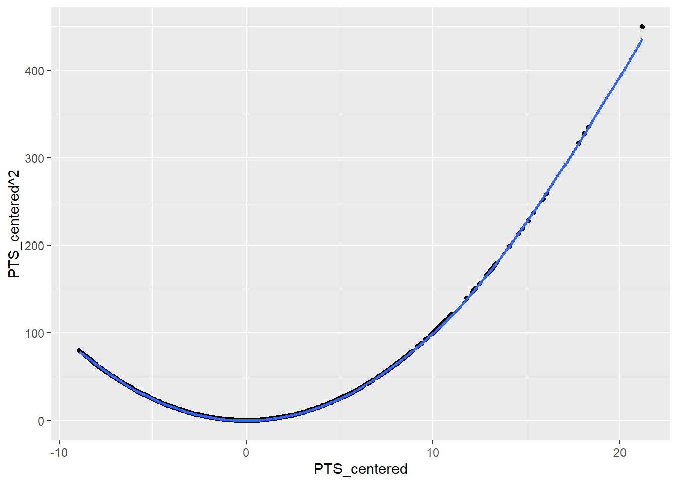
As the square of negative values is positive, we would basically introduce the assumption into the model that there is non-linearity for low and high scorers and that the effect will be in the same direction. While our assumption is that there are diminishing returns between being a high scorer and a really high scorer, we do not assume that making more points if you are among the lower scorers should have the same effect. If at all, in these regions additional points could have an even larger effect.
Because of this we should return to the uncentred version of our variable. What happens if we square this?
data_nba %>%
  ggplot(aes(x = career_PTS, y = career_PTS ^ 2)) +
  geom_point() +
  geom_smooth(se = FALSE)
This is what we wanted, a transformation that expects a stronger difference the higher the score value is. For the final model we will thus work with the uncentered variable. We included the centered version because it is more straightforward to interpret. This is not really a concern anymore because dreams of easy interpretability have long passed after transforming two variables.
We could again transform the variable in our data and thus add a second
version, but we can also do so directly in the formula syntax. When we
use the function I() we tell R to interpret anything within the
parentheses as a mathematical expression. This is what we will do below.
Note that we add the point variable as its untransformed and transformed
versions. The first represents the linear parts and the second the
non-linear parts of the effect.
m4 <- lm(salary_log ~ career_PTS + I(career_PTS^2) + position_center + position_sf + position_pf + position_sg + position_pg, data = data_nba)We can now reassess the tests for the last model.
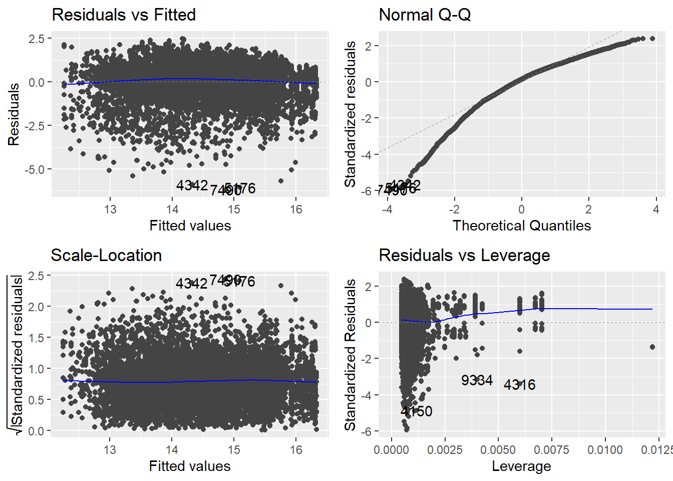
The line in the residuals vs. fitted plot got more straight. It seems
that we actually captured the mild non-linearity that was present before
by adding the squared points value to our model. The scale-location plot
also still indicates no more problems of heteroscedasticity. Contrary,
the data points now are even more evenly distributed compared to m3.
The Q-Q plot has not substantially changed, still showing non-normally
distributed residuals. We can not really fix this now, but we also
learned that this test is less consequential if we have a large \(n\).
Turning to the residuals vs. leverage plot, we still see several points
that do not meet the thresholds but at the same time we do not see any
points with high values for both. Overall there seem to be no overly
influential points which we had to address. Let us also reexamine the
VIF.
##      career_PTS I(career_PTS^2) position_center     position_sf     position_pf
##       12.135096       11.883255        2.040563        1.709312        1.520284
##     position_sg     position_pg
##        1.569463        1.949078
We now see high VIF values for both versions of our point variable,
which is the only substantial change. Did we introduce a new problem? If
we take the measure at face value, yes. But if we think about it, no.
All this means is that both versions of our variable are highly
correlated. Of course they are. One is computed from the other. We can
perfectly predict the value of career_PTS^2 from career_PTS. There
is collinearity by design. If we want to assess multicollinearity we
should apply the function to m3. If we would have used interactions,
the situation would be similar. This is just a small reminder that all
our tests do not work without thinking about what we are actually doing.
8.7 Returning to our research question
As we now settled on m4 as our best model, it is time to discuss what
we actually found out about the effect of scored points on the received
salary.
##
## Call:
## lm(formula = salary_log ~ career_PTS + I(career_PTS^2) + position_center +
##     position_sf + position_pf + position_sg + position_pg, data = data_nba)
##
## Residuals:
##     Min      1Q  Median      3Q     Max
## -6.1886 -0.5744  0.1583  0.7318  2.4876
##
## Coefficients:
##                   Estimate Std. Error t value Pr(>|t|)
## (Intercept)     12.2544680  0.0428953 285.684  < 2e-16 ***
## career_PTS       0.3124511  0.0072287  43.224  < 2e-16 ***
## I(career_PTS^2) -0.0071879  0.0003113 -23.092  < 2e-16 ***
## position_center  0.5482072  0.0326289  16.801  < 2e-16 ***
## position_sf      0.1067444  0.0292656   3.647 0.000266 ***
## position_pf      0.1214253  0.0270641   4.487 7.32e-06 ***
## position_sg     -0.0025577  0.0275935  -0.093 0.926150
## position_pg      0.0312286  0.0337077   0.926 0.354234
## ---
## Signif. codes:  0 '***' 0.001 '**' 0.01 '*' 0.05 '.' 0.1 ' ' 1
##
## Residual standard error: 1.039 on 9720 degrees of freedom
## Multiple R-squared:  0.3978, Adjusted R-squared:  0.3973
## F-statistic: 917.1 on 7 and 9720 DF,  p-value: < 2.2e-16
The more points a player scores, the higher the salary is estimated. At the same time we have identified a non-linear aspect to this relationship. The non-linear effect is small but negative. This indicates diminishing returns for high scorers. The higher the score, the less positive the effect of additional points is.
The problem after two transformations of involved variables is, that interpretation has lost all its intuitiveness. The effects now describe the change in logarithmised salaries. While we can still easily assess if an effect is positive or negative we do not really know what the magnitude of an effect is. For this we have to reverse the transformation.
Let us revisit our example of a center and a point guard making \(20\) points per game from above. Note that we also have to take the square of points for the non-linear term.
\[\hat{y_{center\_20}} = 12.2544680 + 0.3124511 * 20 - 0.0071879 * 20^2 + 0.5482072 \\ = 16.17654\]
\[\hat{y_{pg\_20}} = 12.2544680 + 0.3124511 * 20 - 0.0071879 * 20^2 + 0.0312286 \\ = 15.659565\]
To find out what this means in hard dollars, we have to reverse the
logarithmus naturalis. We can do this by calculating \(e^{\hat{y}}\). R
gives us the function exp() to do just that.
## [1] 10601860## [1] 6322119For our center who scored \(20\) points we thus estimate a salary of \(10,601,860\$\), for a point guard with the same amounts of points \(6,322,119\$\). These estimates are not only lower than the ones derived above, the difference between the positions is also more pronounced. For a point guard, scoring additional hoops does not have the same payoff compared to a center. While the latter receive a higher pay in general they also receive more per additional point scored.
As the name suggests and as we have seen in our exploratory data analysis, point guards make a lot of points. At the same time they earn considerable less. Above we see an estimated difference of over \(4,000,000\$\) between high scoring centers and point guards. The question remains why this is the case. Maybe there are some additional variables we had to consider to fully unravel this. For example it is reasonable to expect some effects on salary that are not connected to the performance in terms of scoring. Both positions fill different roles in basketball game. Centers, besides scoring, have to get rebounds and facilitate turnarounds. Point guards on the other hand have the role to build opportunities for their team and pass to other players. Both measures of performance were not considered in our model but are highly valuable to any team. Also there is something we can call “starfactor” or “flashiness”. A center is much more visible in the game, takes big jumps and dunks. Maybe a center is not only more valuable in terms of performance but also in being an attracting force for fans. This could change the relationship between points and salary for players with a high “starpower”. Such a variable would be hard to measure, but could maybe solve the parts of the puzzle that still remain.
8.8 Moving on
In this session our goal was to achieve an unbiased estimate for the effect from points per game on the received salary. As we have already mentioned, we could have chosen a different approach. Our goal could have been to predict the value of salary to the highest possible accuracy. We will tackle this second approach in in session 10.