6 Week 6: Simple Graphs (one variable)
Objective of this session:
- Learn how to produce simple bar-charts, box-plots, line plots and scatterplots using one variable at a time
R commands covered in this session:
- ggplot()
The past weeks have not been pleasing to the eye. Tables, stats,
code…all was pretty black and white and mostly abstract. This will
change this week. We have finally arrived. The next couple of weeks, we will
add colour to our lifes and learn how to produce various different types
of graphs in R.
As always with R, there are different ways and packages to do that. We will focus here on the ggplot2() package which is used more widely and is quite powerful.
6.1 Choosing a Chart
The main problem does not lie in the creation of a chart. R can do (almost) any chart you can dream up. The diffculty consists in thinking hard about what is it that you want to show to the reader. What is your message? What do you want to show?
Decision 1: What is your objective?
There are different ways to think about how to select an appropriate graph. The visual below is a helpful start. Here is another overview. In most cases, you will have one of four objectives: Comparison, relationship, distribution, composition.
Decision 2: Does time matter?
The second aspect you need to think about is whether you have any sort of time dimension in your data.
Decision 3: What type of variables do I want to visualize?
Thirdly, you need to be aware of what kind of variabels you are using. How are they coded? What are their values and types? The most important distinction here is between categorical/ discrete (incl. dichotomous/ binary variables) and continuous variables. This will determine what chart you can use.
Decision 4: How many variables?
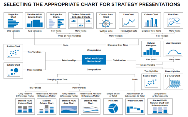
Source: Selecting the Right Chart for your Presentation – Moving People to Action (conorneill.com)
R has a great website to get inspiration. Also see below a Figure including various chart types that R can produce. The best resource is this beautiful website: From data to Viz | Find the graphic you need that lets you browse through options in an interactive manner.
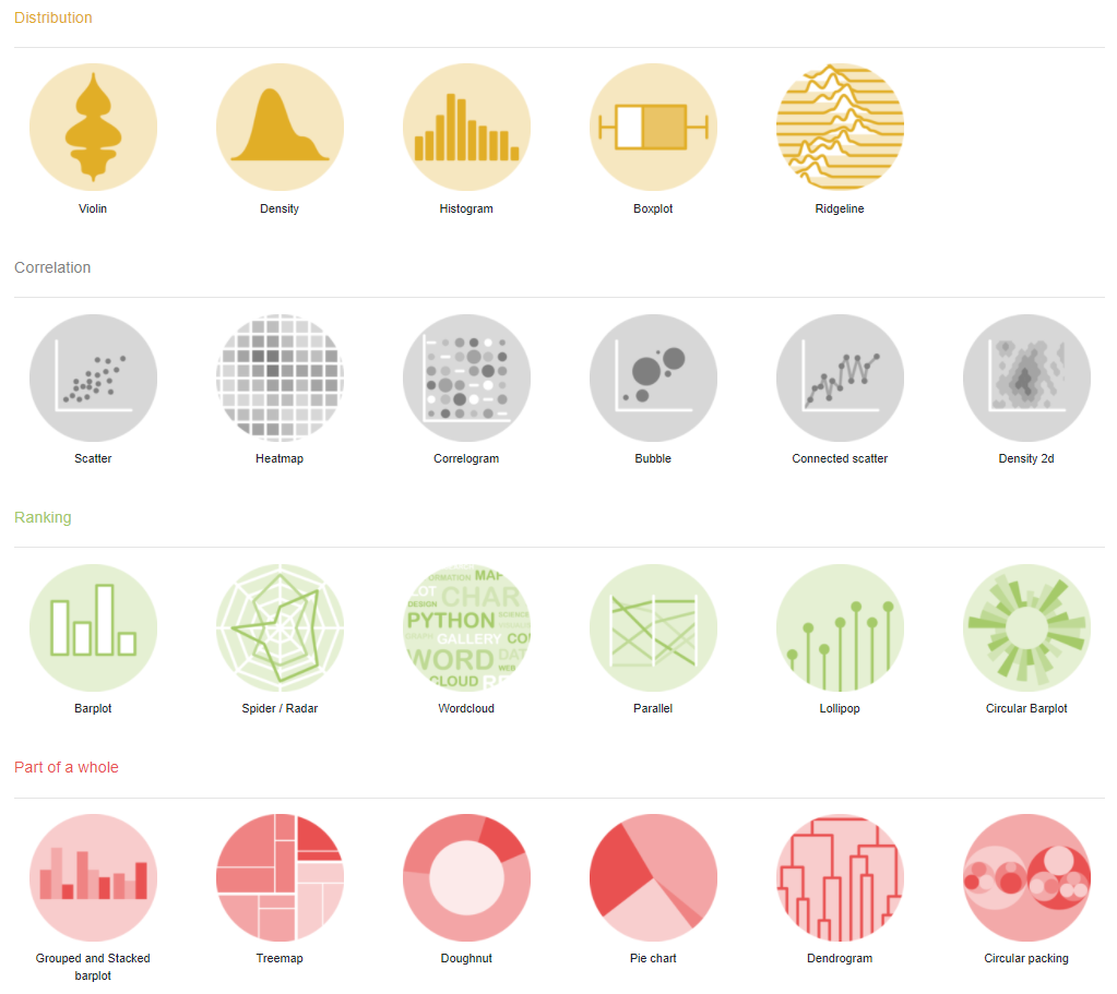
Source: https://www.r-graph-gallery.com/
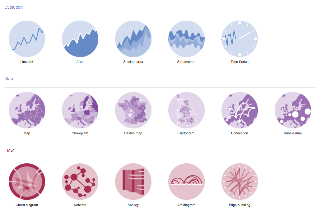
Source: https://www.r-graph-gallery.com/
The options can get overwhelming quickly. The way I am structuring this introduction of graphics is by the number of variables that we are visualizing. As a result, we will start easy and get more complicated. In the process, we will come across various types of graphs. First, let me introduce some basics.
6.2 Understanding the Grammar of ggplot()
Building a graph using ggplot() has several key steps:
Prepare the data that you want to use for the plot and save it in a data frame. For some easier graphs, you can use the raw dataset and pull out the statistics you need in the
ggplot()functions. You do not need to prepare them beforehand, but it depends on the individual case.Use
ggplot(data, aes(x= , y=))to set the data frame, the x (horizontal) and the y (vertical) axis to the variables of interest.aesstands for aesthetics and maps your x and y arguments.Add the
geom: Geoms are geometric objects (points, lines, bars, etc.) that can be placed on a graph. They are added using functions that start withgeom_.Adding details: grouping, faceting, labels, scales, statistics
6.3 Our Focus Today
We will now run through several examples. The table contains the types of charts that we will focus on in this session.
| # variables | Type of variables | Chart type |
|---|---|---|
| One variable: | Categorical: | bar chart |
| Continuous: | box pot | |
| histogram |
6.4 One Variable
6.4.1 Categorical
First, we want to visualize one single categorical variable. Let’s take
faculty from the students data set we’ve been using during the
past weeks. Let’s first look at the variable again using table().
Then we create the graph in several steps using the ggplot2 package.
We call ggplot(), indicate the data frame we want to use and then
define what we want to see on the x-axis using aes(x=, y=). For now,
there is no variable on the y axis since we are only using one variable.
Second, we add the bar element using geom_bar(). This is literally
done by inserting a + followed by geom_bar().
##############
## categorical
##############

table(students$faculty)
##
## Business Economics Political Science Sociology
## 339 225 264 162# define data space and axes
ggplot(students, aes(x=faculty))
# add bars

ggplot(students, aes(x=faculty)) +

  geom_bar()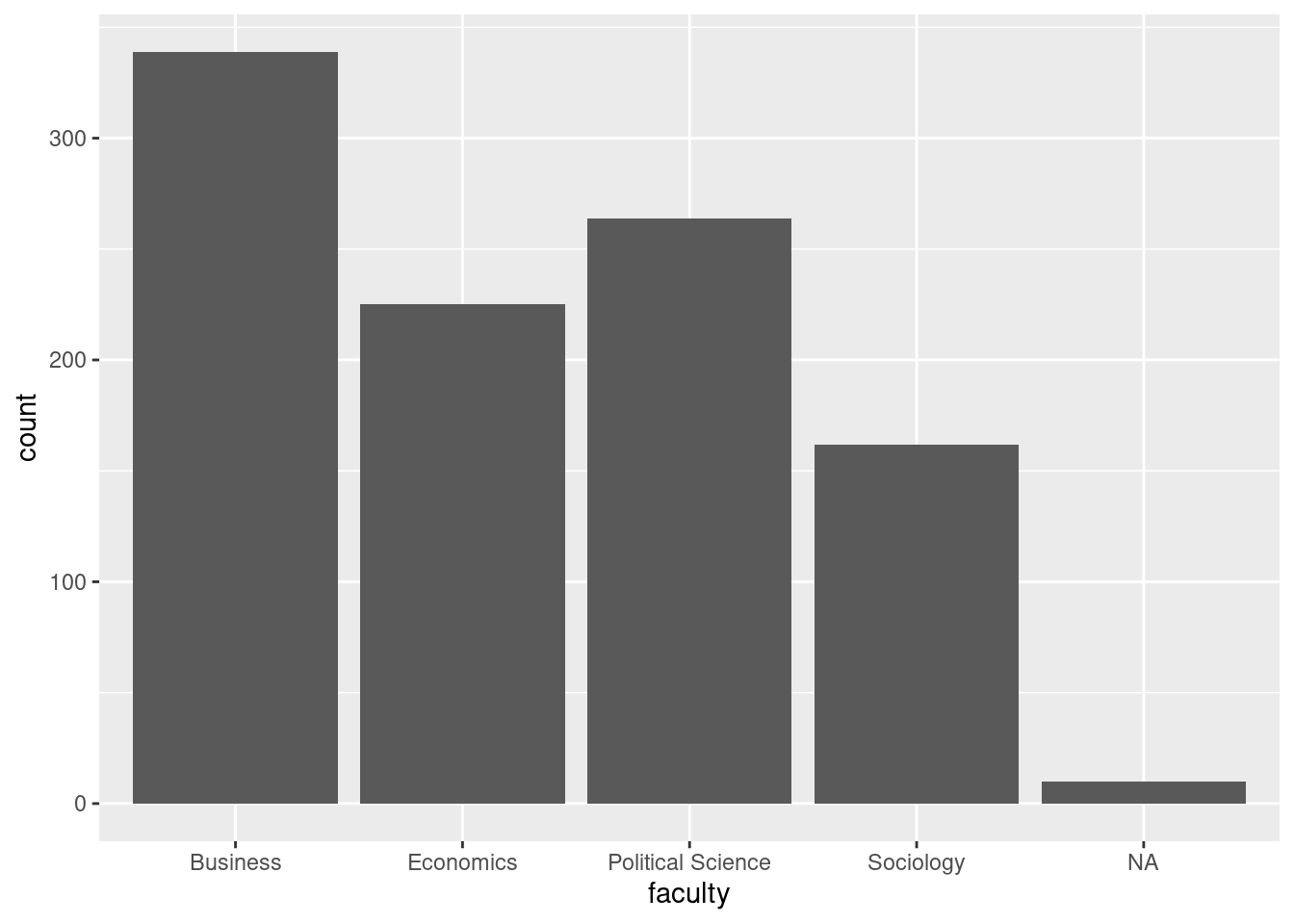
This is a good start. Note that geom_bar() with a single variable
shows the “count” (number of observations/ rows in the data) on the
y-axis.
We have our first bar chart.
Let’s reorder the bars by number of observations, so they go from
largest to smallest using the fct_infreq function from the forecast
package which comes with the tidyverse package (so we don’t have to
install and load it separately).
Next, let’s change the color using fill= and make the width of the
bar a little smaller using width=. Click
here to get a
full list of color names in R.
# change order

ggplot(students, aes(x=fct_infreq(faculty))) +

  geom_bar()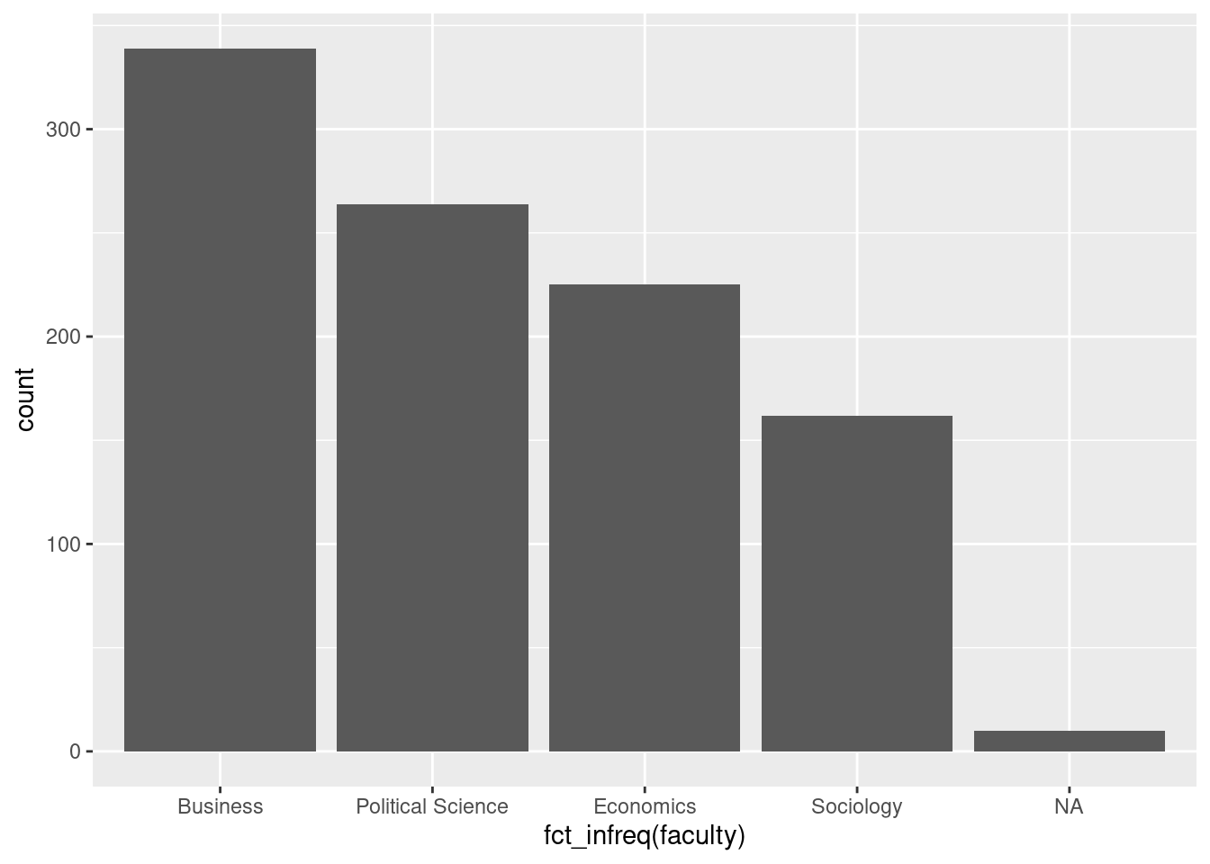
# change color & bar width

ggplot(students, aes(x=fct_infreq(faculty))) +

  geom_bar(fill="lightgreen", width = 0.8)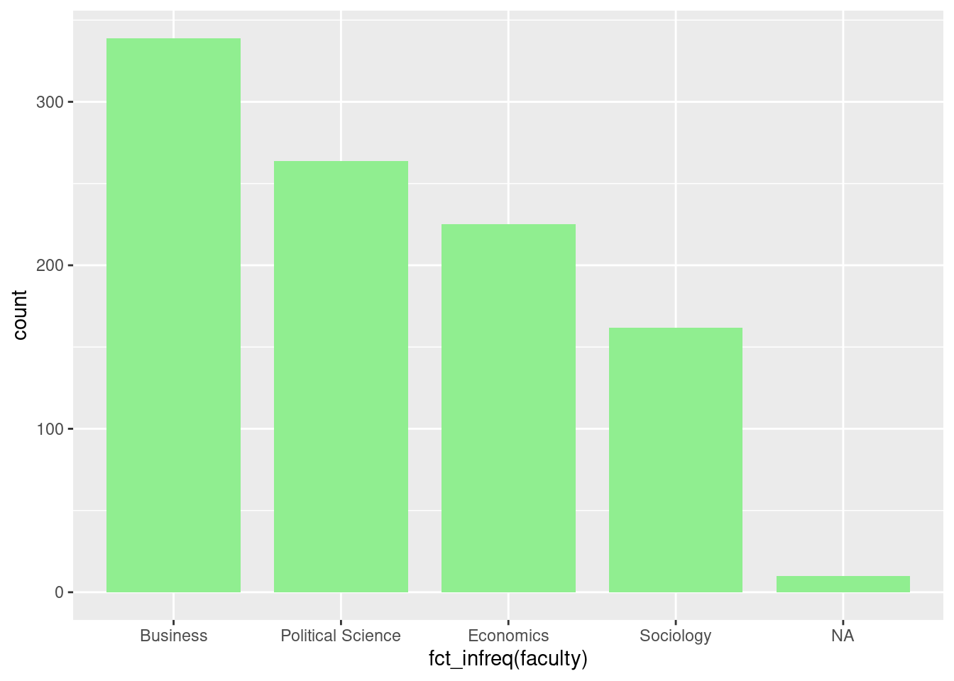
Finally, let’s add some labels and save the graph. Remember to add
things to the plot by using + (rather than the pipes %>% as we
did when we managed our data.
# add labels

ggplot(students, aes(x=fct_infreq(faculty))) +

  geom_bar(fill="green", width = 0.8) +

  labs(title = "My first bar chart",

    subtitle = "The number of students by faculty",

    caption = "University of Potsdam, Intro to R course, 2021")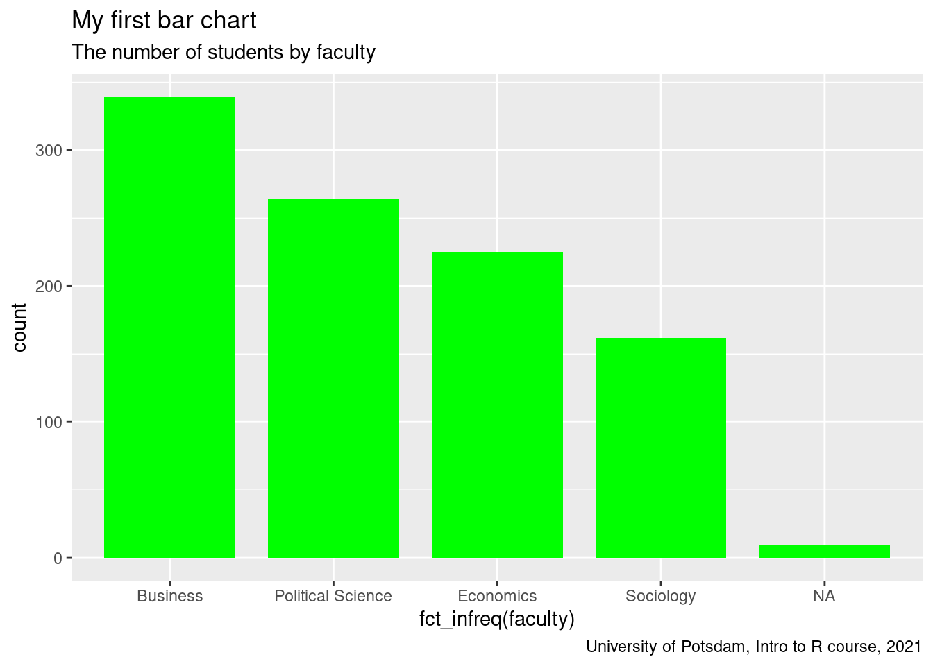
6.4.2 Continuous
The first example showed how to produce a simple bar chart for one categorical variable. Let’s now turn to continuous (sometimes also called “quantitative” or “metric” variables) like age, income, life satisfaction etc. There are two basic plots that explore one single continuous variable: histograms and boxplots. Histograms visualize numerical data by showing the number of data points that fall within a specified range of values (called bins). It is similar to a vertical bar graph.
There is a “quick and dirty” way to get a histogram and a boxplot in R
using hist() and boxplot() (see below). However, I will stick
here to the ggplot() approach. The more familiar you get with
ggplot(), the more you will be able to later visualize very complex
things.
What’s new here? We define age at the x-axis and instead of
geom_bar(), we use geom_histogram(). Also, to change the look of
the whole graph we apply a theme using theme_bw().
Tip: There are a number of default themes that you can choose. This is A LOT easier and quicker than changing the look manually which is definitely possible (we will do some tailoring next week).
##############
## continuous
##############

# quick and dirty (no ggplot)

hist(students$age)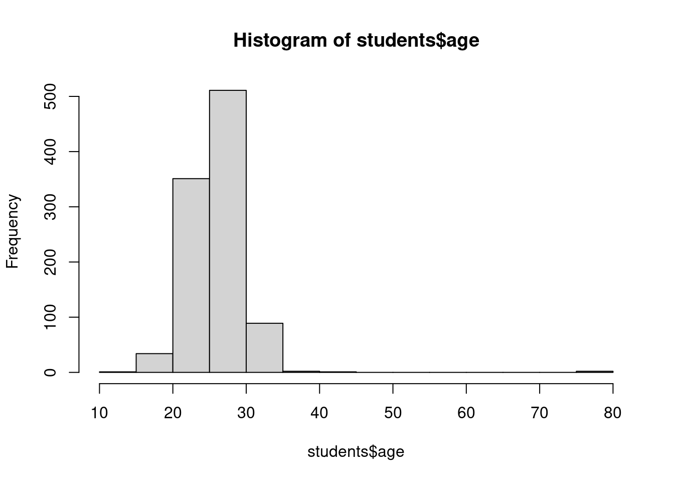
boxplot(students$age)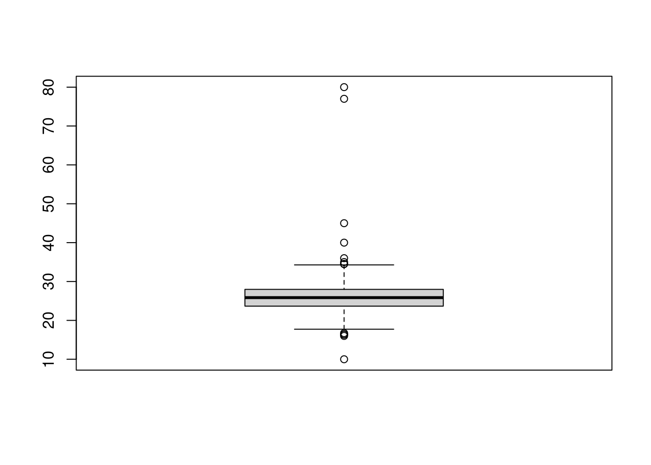
# histogram: the ggplot approach

hist1 <- ggplot(students, aes(x = age)) +

  geom_histogram(binwidth = 0.5, fill = "lightblue") +

  labs(title = "My first histogram",

       subtitle = "The number of students by age",

       caption = "University of Potsdam, Intro to R course, 2021") +

  theme_bw()

hist1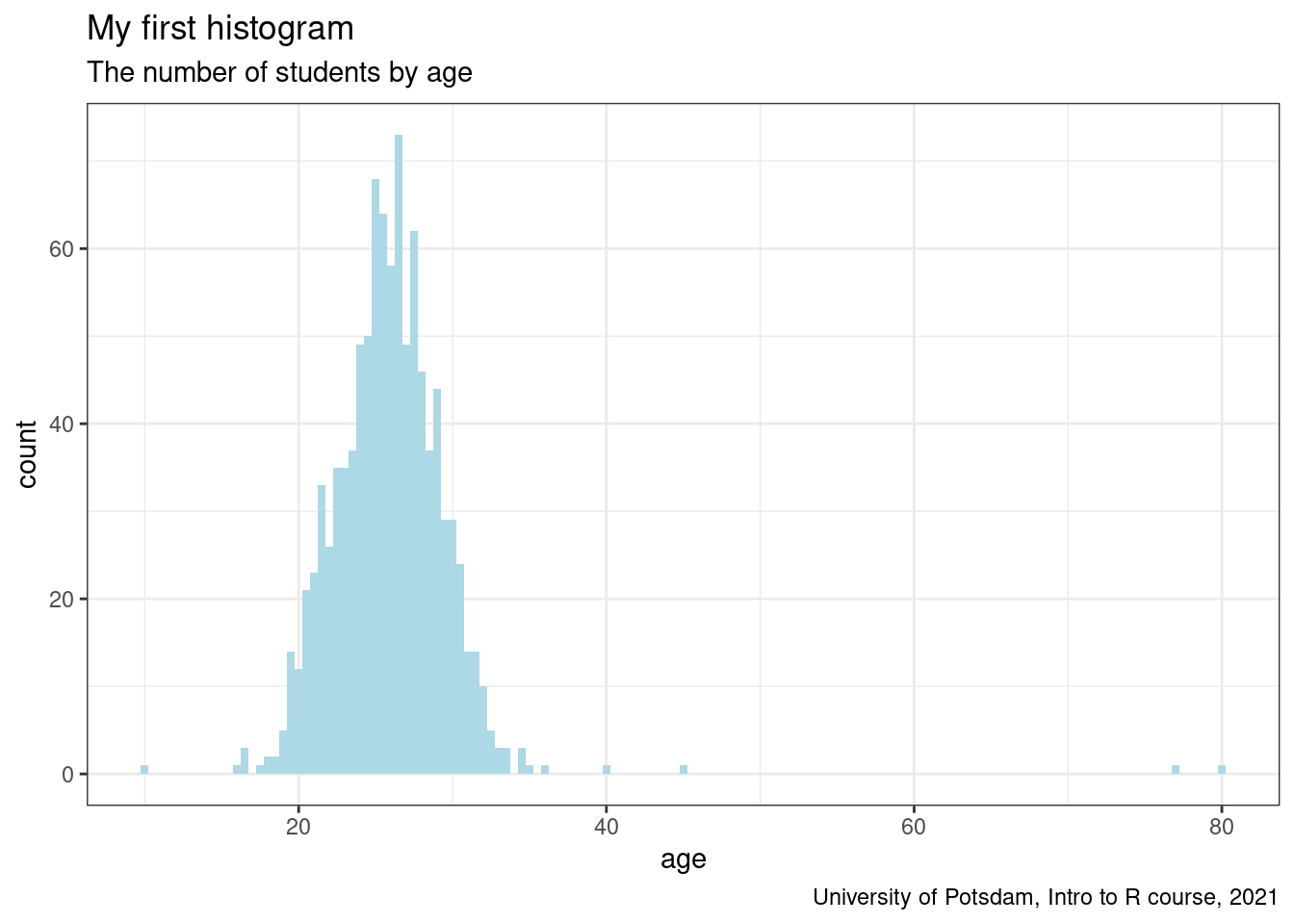
Tip: When you save a ggplot() in an object, R won’t display it
automatically in the viewer. You need to call the object for R to
display it.
That was pretty easy. Now, let’s produce a boxplot. If you do not
remember what a boxplot is, click
here for a reminder
and a longer intro on how to produce it in R. In short, a boxplot
visualizes variation in a variable by plotting the median, quartiles,
min/max points and outliers as a literal box with whiskers. During the
data cleaning and exploration process, boxplots are useful to check for
outliers. Outliers could be just mistakes during data entry (in which
case you need to delete them), if not, they can mess with your averages,
so it is important to know about them. Note that we need to switch to
the y-axis in the aes() function to let the graph appear vertically,
otherwise it appears horizontally.
# boxplot (change axis)


boxplot1 <- ggplot(students, aes(y = age)) +

  geom_boxplot(fill = "orange") +

  labs(title = "My first boxplot",

       subtitle = "The distribution of student age",

       caption = "University of Potsdam, Intro to R course, 2021") +

  ylab("Respondents's age (in years)") +

  theme_light()

boxplot1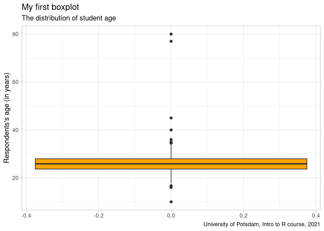
6.5 Export Plots
One way to export our plots you’ve probably already figured out. It’s using the
keyboard shortcut of a screenshot: ctrl + shift + PrtScn button. But that
produces a picture with a low resolution you’d probably not want to use anyway.
Instead we’ll use the ggsave() function. Use it after you’ve produced your
desired plot. In our case, that’s the line_graph from above as it’s our last
plot. We can use the function in its most basic version only specifying the
name of the file, the image format to be used and the path. However, we could
also determine the width and height as well as the unit of reference of our plot.
ggsave("some/folders/here/my_super_cool_plot.png")
ggsave("some/folders/here/my_super_cool_plot.jpg",
       width = 20, height = 20, units = "cm")
6.6 Exercises I (based on class data)
Your employer, the head of university, storms into your office yet again with another bundle of descriptive analytic tasks for you to carry out. You suspect a kind of frantic paranoia but are subject to his whims. This time, the head of university is interested in the students. Instead of numbers, you are to produce nice-looking, well-labelled graphs. Good luck!
The first graph should show the distribution countries of origin in the student body. Remember: What type of variables are of interest? How many variables do you need here? Which one is on the x-axis, which one is on the y-axis?
Before you start plotting, first consider what types of variables are needed. Convert them if necessary.
Next, check whether there are NA or outliers you would rather not want to include in the plot.
With the second graph, you are supposed to show the distribution of life satisfaction in the student body. Think about which type of graphs are appropriate to visualize this data type.
For this task, you would need to convert the data type of the variable of interest.
Report the findings. Can you explain what you are seeing?
The last graphs of the day consist of two boxplots showing the range of satisfaction with the courses in the faculty Economics and Business as well as Political Science and Sociology respectively in the student body. Your employer fears that the satisfaction between the two disciplines are unbalanced. Maybe Business and Economics students are miserable? Or Political Science and Sociology students are a tad to happy to be hard-working? Let’s generate pretty looking and well-labelled boxplots to find out. Each boxplot should show the range of satisfaction within the two disciplines.
First, create two data sets filtered for the two disciplines: Economics and Business, Political Science and Sociology.
What is the verdict?
6.7 Exercises II (based on your own data)
Revisit your individually chosen dataset. Find suitable data to produce three graphs:
A univariate continuous graph of your choice.
A scatterplot of your choice.
Write down what you have learned from looking at the data visually.