7 Week 7: Simple Graphs (two variables)
Objective of this session:
- Learn how to produce simple bar-charts, box-plots, line plots and scatterplots using two variables at a time
R commands covered in this session:
- ggplot()
This week will build on the skills and knowledge acquired last week. Instead of
focussing on one variable, let’s consider two! Mind-boggling, we know!
We will continue using the ggplot2() package which is used more widely and is quite powerful.
7.1 Our Focus Today
We will now run through several examples. The Table contains the types of charts that we will focus on in this session.
| # variables | Type of variables | Chart type |
|---|---|---|
| Two variables | Categorical – Categorical | Grouped bar chart |
| Stacked bar chart | ||
| Categorical – Continuous | Grouped bar chart | |
| Grouped boxplot | ||
| Grouped violin plot | ||
| Continuous – Continuous | Scatterplot | |
| Line plot |
7.2 Two Variables
7.2.1 Categorical + Categorical
Let’s move on to visualizing two variables at the same time. This is usually done using “stacked” (bars that are on top of each other) or “grouped” (bars that are next to each other for separate groups).
In our example here, we want to see whether students that have a
working-class background also tend to have side jobs more often than
students with no working-class background. First, we check the variables
using table(). Thereafter, we apply ggplot() using
geom_bar(). The difference now is the fill option in aes().
It tells R to distinguish between different values of workingclass.
###############################################################################
### Two variable (i.e. bivariate)
###############################################################################

#### Categorical - categorical

table(students$job)
##
## no yes
## 559 432table(students$workingclass)##
## no yes
## 496 495# stacked bar chart
ggplot(students, aes(x=job, fill= workingclass)) +
geom_bar()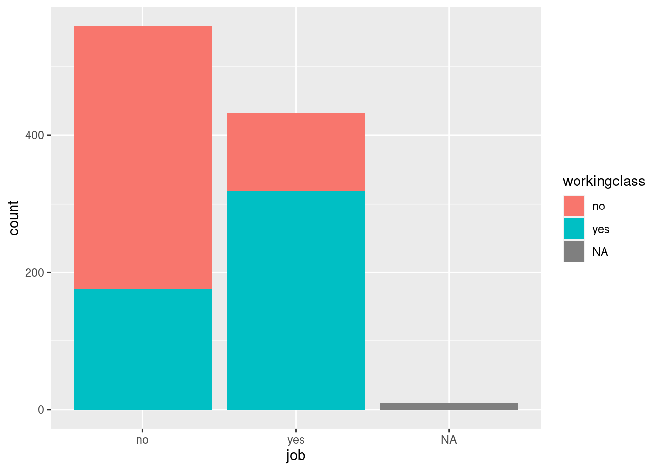
Next, we want to convert the default counts on the y-axis to
percentages. This is done by adding position="fill" within the
geom_bar() argument AND by adding details on the scale of the axis
using scale_y_continuous(labels = scales::percent). Reminder:
Whenever you add things to your graph, use a new row in your code and
end the previous row with a + sign.
# stacked 100% bar

bar_stacked <- students %>% filter(!is.na(job)) %>%

  ggplot(aes(x=job, fill= workingclass)) +

    geom_bar(position="fill") +

    scale_y_continuous(labels = scales::percent) +

    ylab("Percentage")

bar_stacked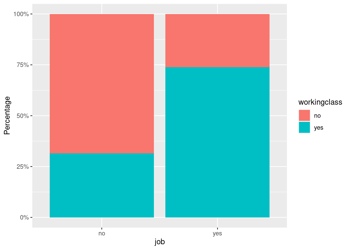
Now, let’s produce a grouped bar chart. We need separate bars for each
value of working-class side by side. We do this by changing the
position= argument to “dodge.”
# grouped bar chart (frequency counts)

students %>% filter(!is.na(job)) %>%

  ggplot(aes(x=job, fill= workingclass)) +

    geom_bar(position="dodge") +

    scale_y_continuous(labels = scales::percent)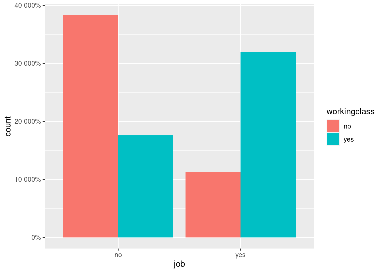
The y-axis looks strange. What happened? In this case, ggplot() does
not really know which percentages you want to show there, so it just
adds a percentage sign to the count and multiplies it by 100.
One way to handle this is to actually first produce a data frame that
contains percentages and then graph them directly. We calculate the
percentages by using summarise() and mutate() which we learned
in previous sessions.
We also need to add the stat=identity argument within the
geom_bar() function to tell R that we actually want to plot the
numbers in that cell rather than counting the aggregate number of rows
for each x value, which is the default stat=count. In previous
examples, ggplot() automatically calculated counts by group. Now, we
provide R with the final number we need.
# grouped bar chart (percentages)

bar_grouped <- students %>% filter(!is.na(job)) %>% group_by(job, workingclass) %>%

  summarise(n = n()) %>%

  mutate(percent = n/sum(n) * 100) %>%

  ggplot(aes(x= job, y=percent, fill=workingclass)) +

    geom_bar(position="dodge", stat="identity")

bar_grouped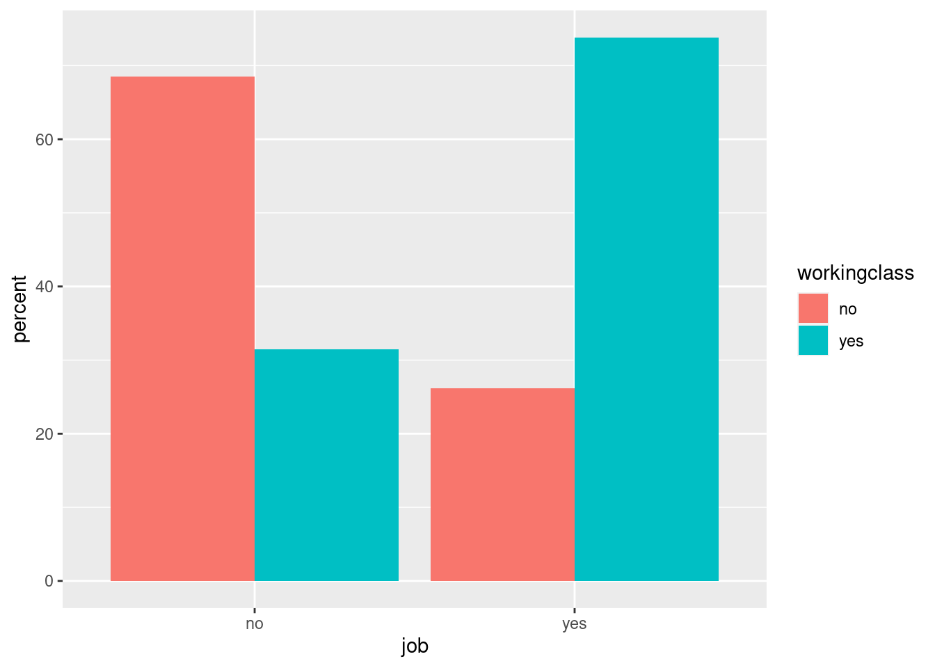
In our example, the graph clearly shows that students that have a job are also more likely to have a working-class background.
7.2.2 Categorical – Continuous
Now, we want to visualize a combination of a continuous and a categorical variable. Let’s say we want to look at the life satisfaction (continuous: measured on a scale from 0 to 100) of students by their relationship status (binary: yes or no). Who is happier?
We first convert lifesat into a numerical variable (mutate()),
then we kick out missing values (filter()), then we calculate the
average life satisfaction by relationship status (group_by() and
summarise()), and finally, we plot it using ggplot().
One new element here is the “limits” option within the
scale_y_continuous() function. It fixes the starting and ending
values of the axis.
The graph shows that life satisfaction appears to be similar for people in and outside of a relationship. So good news for everyone, I suppose.
# bar-chart showing means

bar_means <- students %>%

  mutate(lifesat = as.numeric(lifesat)) %>%

  filter(!is.na(relationship)) %>%

  group_by(relationship) %>%

  summarise(mean_lifesat = mean(lifesat, na.rm = TRUE)) %>%

  ggplot(aes(x=relationship, y=mean_lifesat)) +

    geom_bar(stat="identity") +

    scale_y_continuous(name = "Average Life Satisfaction", limits = c(0, 100)) +

    theme_bw()

bar_means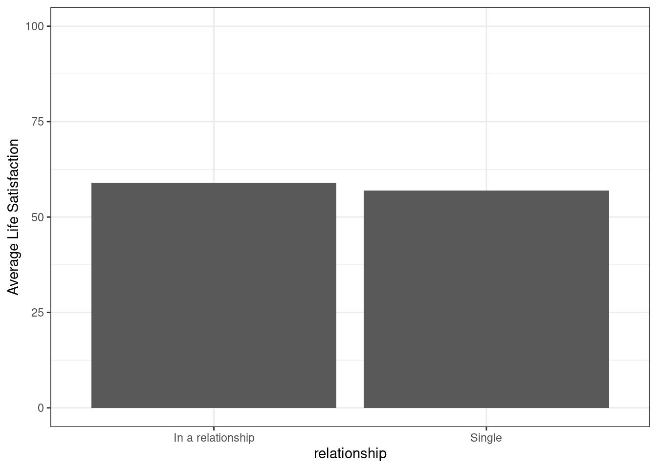
Another example to combine continuous and categorical variables are grouped box-plots by showing distributions of continuous variables by different groups. Here, let’s look at the age distribution by faculty. We see that the median age does not seem to differ much. However, the economics department apparently has the youngest student of all.
# grouped boxplot

boxplot2 <- ggplot(students, aes(y=age, x=faculty)) +

  geom_boxplot(position="dodge", fill = "orange") +

  labs(title = "My second boxplot",

    subtitle = "Distribution of student age by faculty",

    caption = "University of Potsdam, Intro to R course, 2021") +

  ylab("Respondents's age (in years)") +

  theme_light()

boxplot2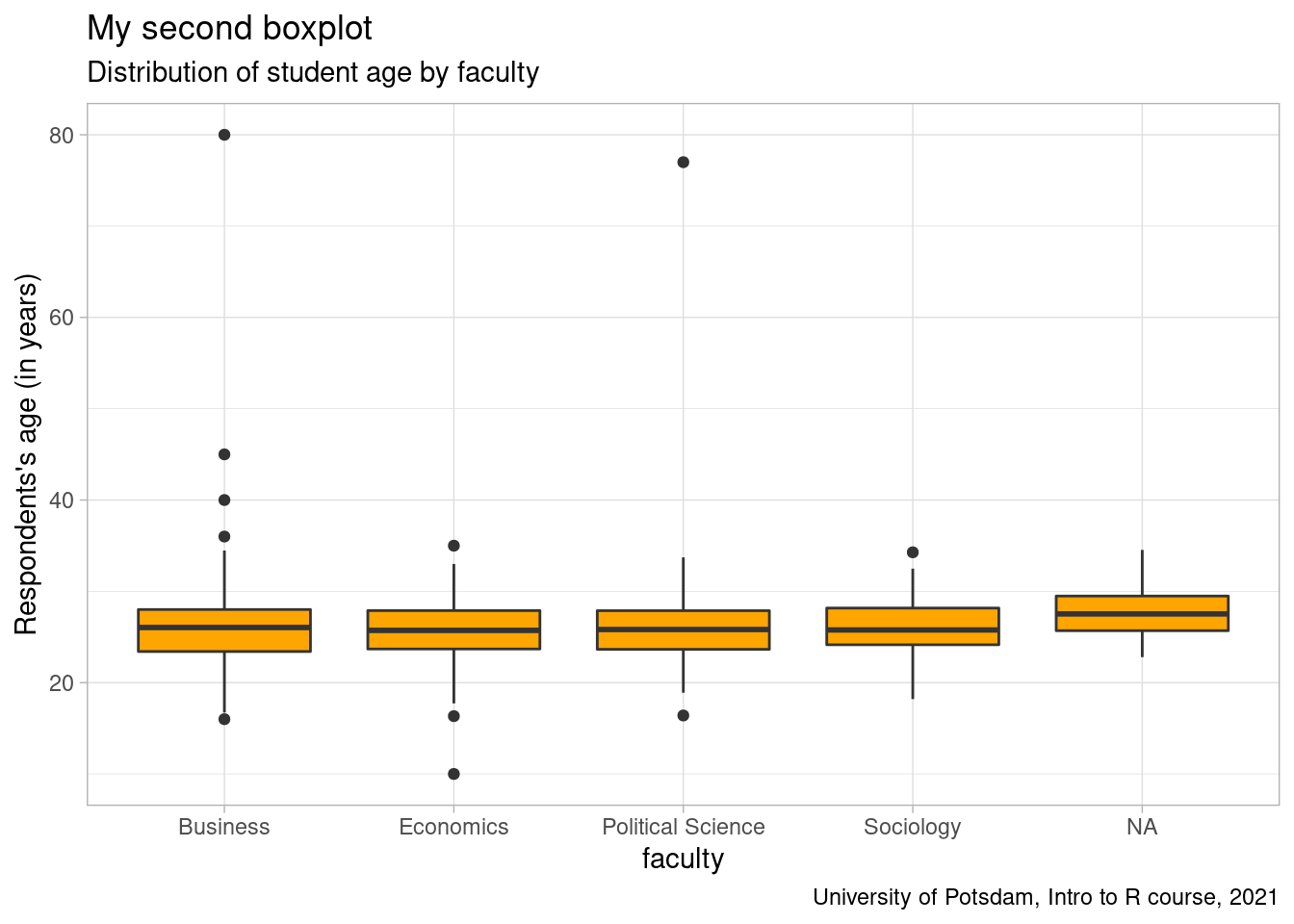
Another option to display distributions are violin plots. Their bellies
indicate where most observations are. Note that we display every faculty
in a different color by, in this case, adding the fill= argument to
aes(). We repeat that and add the box-plot inside the violin (just
for fun.).
# onion plot (looks cooler)

violin1 <- ggplot(students, aes(y=age, x=faculty, fill=faculty)) +

  geom_violin(position="dodge") +

  labs(title = "My first violin plot",

    subtitle = "Distribution of student age by faculty",

    caption = "University of Potsdam, Intro to R course, 2021") +

  ylab("Respondents's age (in years)") +

  scale_y_continuous(limits= c(0,65)) +

  theme_light()

violin1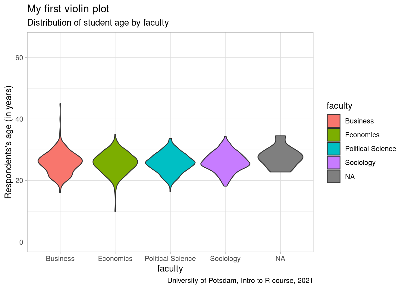
violin2 <- ggplot(students, aes(y=age, x=faculty, fill=faculty)) +

  geom_violin(position="dodge") +

  geom_boxplot(width=0.2) +

  labs(title = "My second violin plot",

    subtitle = "Distribution of student age by faculty",

    caption = "University of Potsdam, Intro to R course, 2021") +

  ylab("Respondents's age (in years)") +

  scale_y_continuous(limits= c(0,65)) +

  theme_light()

violin2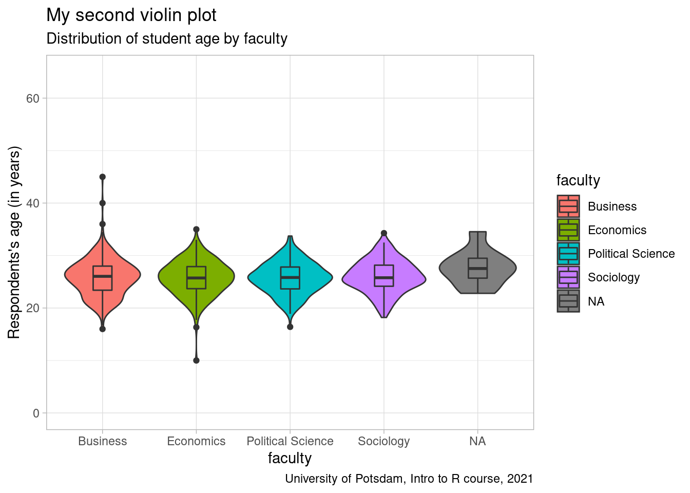
7.2.3 Continuous – Continuous
Lastly, let’s take two continuous variables and plot them. You can do
this with scatterplots and line graphs. Most textbooks use scatterplots
to introduce ggplot() and to show what R can do. They are intuitive
and pretty. They show the relationship between two variables nicely and
they are a good way to segue into correlations and linear regression
(which we will not cover here). They are also very easy to do. Make sure
your two variables are both numeric, define them each as x and y axis in
aes() and then use geom_point().
After we exclude outliers, it looks like older students are happier. Maybe they are glad to finish their programs soon?
# scatterplot

students %>% ggplot(aes(x=age, y=as.numeric(lifesat)))+

  geom_point()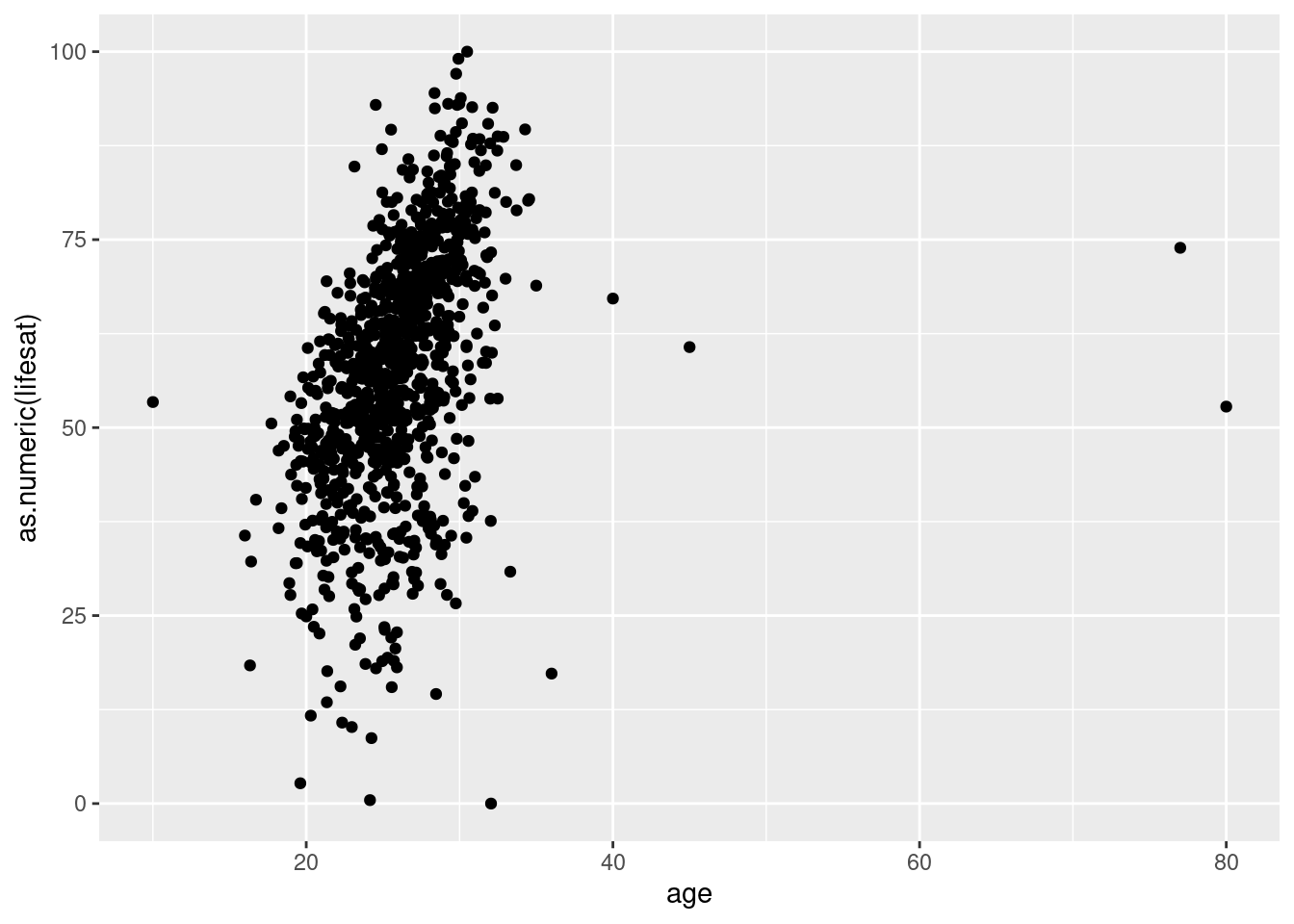
# let's exclude outliers (people over 40 and under 17)

Scatter1 <- students %>% filter(age<40 & age>16) %>%

  ggplot(aes(x=as.numeric(lifesat), y= age))+

    geom_point()

Scatter1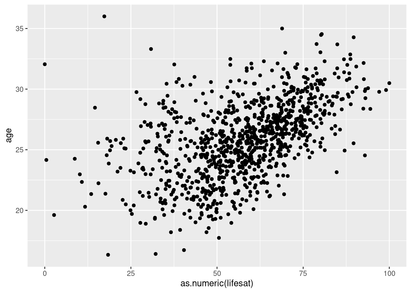
Line graphs are an interesting option for data that has a time dimension (years, months days etc.). Line graphs need only one value by time interval.
Coincidentally, our data frame does have yearly data on grades. But
first we need to get it into the right shape. In our example below, we
summon the full force of our excellent data wrangling skills (see week 3
and 4) before plotting. We convert the grade variables into long format,
then we change the values of the newly created year variable to only
contain numbers and convert it to a numerical variable. Finally, we
calculate the average grade per year and plot the relationship of
interest using geom_line().
We will also use a shortcut which is a so-called string function
(str_replace_all()) which can replace a certain character sequence
(in our case “gpa” with another value (in our case nothing, empty
quotations "“). What that does is just to change all values in that
column and take away the”gpa_prefix" because later we only want the
years in the new, restructured long-format cell.
# line graph (when one variable is time)

line_graph <- students %>%

  pivot_longer(matches("gpa_"), names_to ="year", values_to ="gpa") %>%

  mutate(year = str_replace_all(year, "gpa_", ""),

        year = as.numeric(year),

        gpa = as.numeric(gpa)) %>%

  group_by(year) %>%

  summarise(gpa = mean(gpa, na.rm = TRUE)) %>%

  ggplot(aes(x=year, y=gpa))+

    geom_line()

line_graph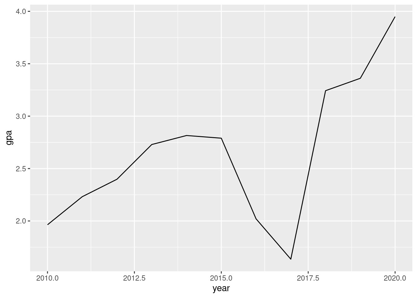
Not sure what happened after 2017, but students’ grades appear to have changed drastically.
7.3 Exercises I (based on class data)
Your employer, the head of university, was mildly impressed by your plots last week. But his expectations have risen now! Luckily, so have your skills. You are prepared to sweep him off his feet with bivariate plots. Good luck!
The first graph should show the distribution of how much students like their courses in different faculties. Remember: What type of variables are of interest? How many variables do you need here? Which one is on the x-axis, which one is on the y-axis?
Before you start plotting, first consider what types of variables are needed. Convert them if necessary.
Next, check whether there are NA or outliers you would rather not want to include in the plot. We strongly recommend the “quick and dirty way.”
With the second graph, you are supposed to show how the grades change over the years and whether this trend is the same for students that have a relationship versus those that do not. Think about which type of graphs are appropriate to visualize a time trend.
For this task, you would need to convert the wide format of the GPA variables into a long format.
Do not forget that the head of university wants to be able to tell the differences in GPA scores between students that are in a relationship and students that are currently single.
Report the findings. Can you explain what you are seeing?
The last graph of the day is a barchart displaying the frequency of students per country of origin. Your employer fears that the distribution of countries over the faculties is unbalanced. Maybe Italian students are dominating the business faculty? Or maybe British students have monopolized the Political Science faculty? What if Austrians make up the majority in each faculty? Let’s generate a pretty looking and well-labelled barchart to find out. Each bar should show the share of students from different countries.
First, create a barchart that shows the absolute distribution of represented countries in the university. Where are most students from?
Before you go on to producing the main barchart, you should filter out NA values in both represented countries and faculties.
Do not forget to make it pretty and to add labels!
7.4 Exercises II (based on your own data)
Revisit your individually chosen dataset. Find suitable data to produce three graphs:
A bivariate continuous-categorical graph of your choice.
A scatterplot of your choice.
Write down what you have learned from looking at the data visually.