9 Week 9: Maps
Objective of this session:
Introduce simple ways to plot geospatial data (maps)
Explain basic concepts on plotting spatial data using R
R commands covered in this session:
ggplot()
ggmap()
get_stamenmap()
geom_polygon()
map_data()
qmplot()
9.1 Introduction
You probably use google maps every day: to look how long it takes to get to the train station or to find your next vacation home. Geo-spatial data is all around us. Maps looks easy but there is a lot of science that goes into producing them. Luckily, R provides some easy-to-use tools to create some simple maps. Today, we will learn two ways to do that.
R does a great job at visualizing – what is called - “geospatial data”. Spatial means locations and geo means earth. In the private sector, GIS modelling (geographic information system) is a whole career path and increasingly demanded skill. Few websites these days do not have a map. Maps are also helpful for research and, more generally, to understand the world we live in. Many geographers, but also sociologists, environmentalists and economists are dealing with geo-spatial data. Space and distance help explain many social science phenomena. Think about access to jobs relative to living location or ethnic disadvantage due to spatial segregation. Maps help to uncover these patters. Plus: They look great and are more fun than tables.
First, we will look at examples of different types of maps. Second, we
will gain an understanding of some geo data basics that we need to use
it in R. Third, we will apply two simple approaches (ggplot(),
ggmap()) to produce two distinct maps.
If this is going too slow for you, jump to these great online books on geo-spatial data in R:
A word of caution here: it is easy to quickly get lost. R has many
packages that deal with maps (to name a few: tmap(),
leaflet(), mapview(), sf(), mapdeck(), raster(),
qmplot()). Many of the sophisticated packages require a whole new
type of data format that we have not covered (s4).
9.1.1 Types of Maps
Check out this amazing site for inspiration. Click through different map options in R. When we think of the classic map, we think of country boundaries. There are also bubble maps, direction maps, city and neighborhood maps, climate maps, altitude maps etc.
9.1.2 Fundamental Concepts
For what we want to do today, we need to get two elements right before we can get started in R: 1) Geographic Coordinate System (GCS) and 2) polygons.
GCS is a coordinate system associated with positions on earth (geographic position). In many cases, the position is measured in “coordinates” consisting of latitude and longitude (like a GPS coordinate). The visual below shows how that works. With that system we can quantify any particular position on earth: a city, a house, us etc.
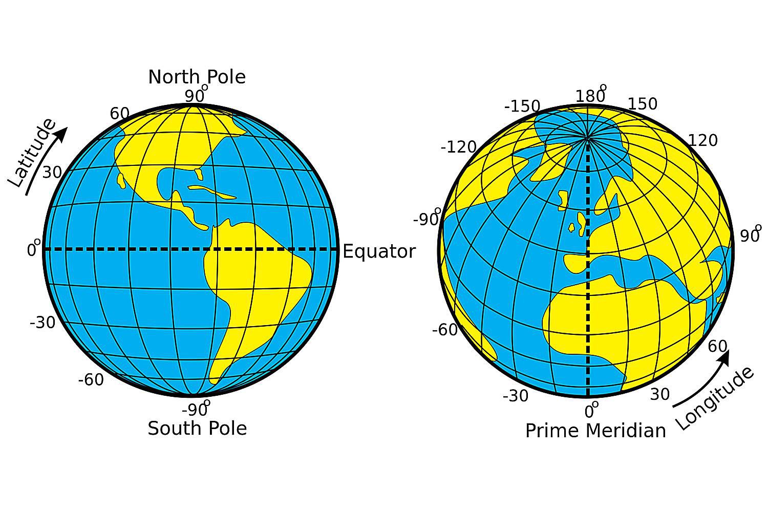
Source: The Distance Between Degrees of Latitude and Longitude (thoughtco.com)
Generally speaking, polygons are these things below: – in more technical terms – a closed two-dimensional shape. The shape forms an area through lines connecting points. A country on a map is nothing less but a polygon, except with more dots and more lines connecting them. The GIS community has made polygon data for countries, regions, subregions, lakes, seas on earth etc. publicly available. We will benefit from that today. In the data, a country is merely a list of coordinates (longitude, latitude) and information on the order by which the points should be connected to form the shape.

9.2 Application in R
The basic process to produce a map is similar across different approaches:
You get a background map image from somewhere
You put another layer on that map to show additional things (e.g. using your own data)
We will cover two simple approaches today: One using ggmap() another
using ggplot() in combination with geom_polygon().
9.2.1 GGmap Package
In this first example, our aim is to create a map of the Berlin region and show the location of the largest universities including their size in terms of student body.
First, we need to install and load the “ggmap” package. Then we need a map
of Berlin. In our approach, we first need to get the coordinates of the
chunk of earth we want to look at. The getbb() function (of the
“osmdata” package) is a shortcut to get the bounding box (bb)
associated with place names. A bounding box is a set of coordinates that
describe a box (a centroid is the coordinate in the center of that
box) which means that the getbb() function yields two values each
for latitude and longitude coordinates.
get_map(). We
are going to use a variation of that command: get_stamenmap(). We
will use stamen maps which are free and easy to import into R. Only use
get_map() for places where providing a single coordinate is enough
to display the surrounding area. This does not work for larger scale
areas like countries or continents.
Tip: The get_map() command used to be able to get maps from Google
Maps and Open Street Maps, but this is not possible anymore without
signing up and paying access to the API. If you do have access to the
google API, there are many more things you can do, so if you are
interested in mapping, it may be worth signing up.
Don’t forget to load the data.`
# install packages using install.packages("ggmap") and install.packages("osmdata") once and load them
library(ggmap)
library(osmdata)

library(tidyverse)

### step 1: get coordinates for map

# berlin
berlin_coordinates <- getbb("Berlin")
berlin_coordinates
## min max
## x 13.22886 13.54886
## y 52.35704 52.67704# getbb() only works for long/lat points (not countries etc.)
?getbb
### step 2: get images for map (from APIs)
# berlin
berlin_images <- get_stamenmap(berlin_coordinates)
berlin_images## 382x233 terrain map image from Stamen Maps.
## See ?ggmap to plot it.# Warning get_map() works with Google API which now requires sign-up and API key
# this also means you cannot type in box coordinates or centroids directly and get a map
# Different ways to import maps
berlin_images1 <- get_map(berlin_coordinates, maptype ="terrain")
berlin_images2 <- get_stamenmap(berlin_coordinates, maptype="toner-2011")
berlin_images3 <- get_stamenmap(berlin_coordinates, maptype="terrain")
# Now, we told R which area we want, and we have loaded the images for that spot. Now, we plot it using the `ggmap()` function.
###step 3: map the empty map
#berlin
berlin_map1 <- ggmap(berlin_images1)
berlin_map2 <- ggmap(berlin_images2)
berlin_map3 <- ggmap(berlin_images3)
# Results
berlin_map1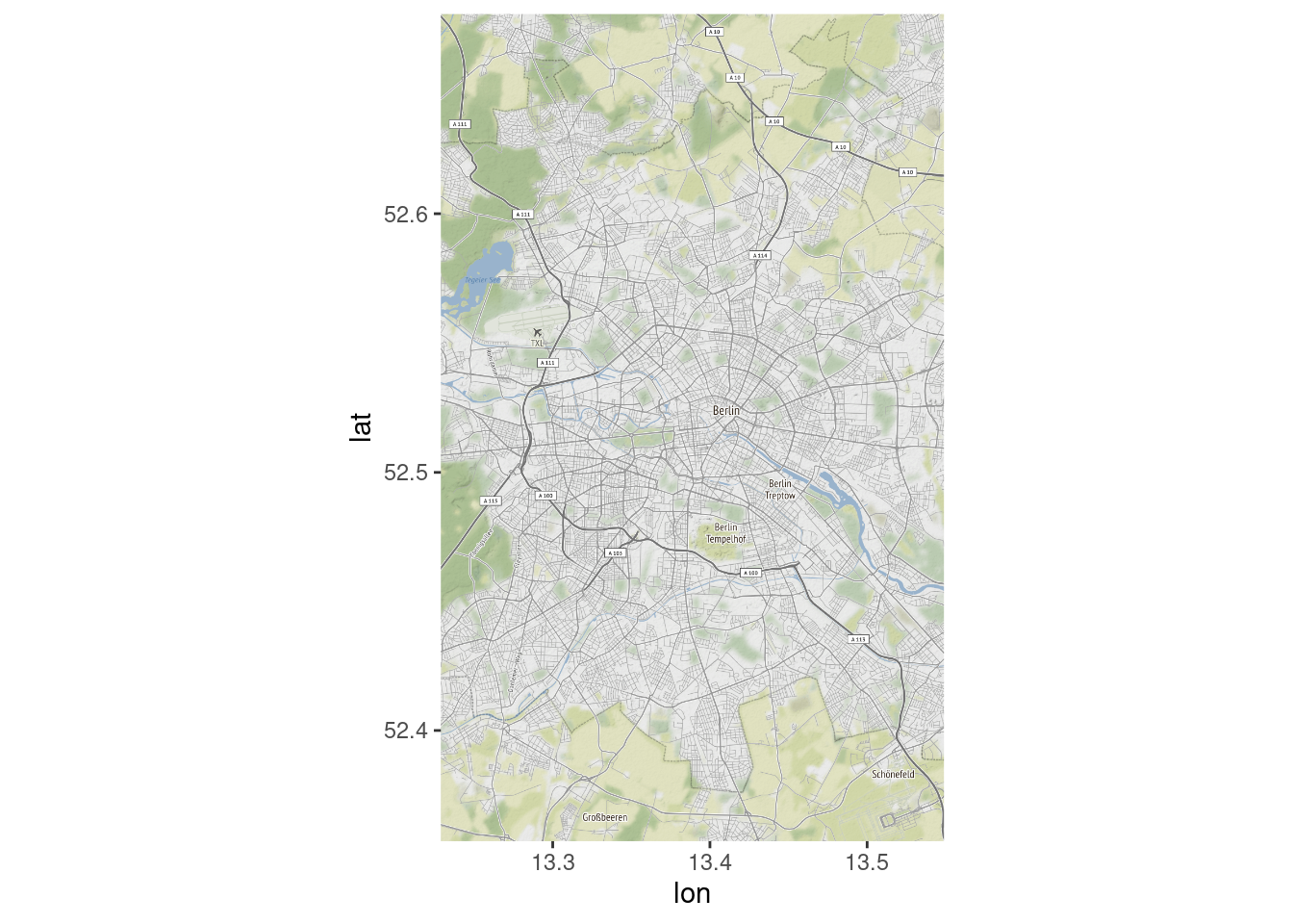
berlin_map2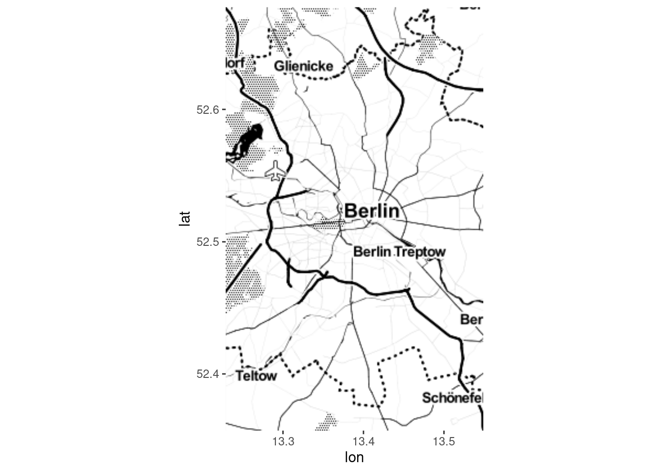
berlin_map3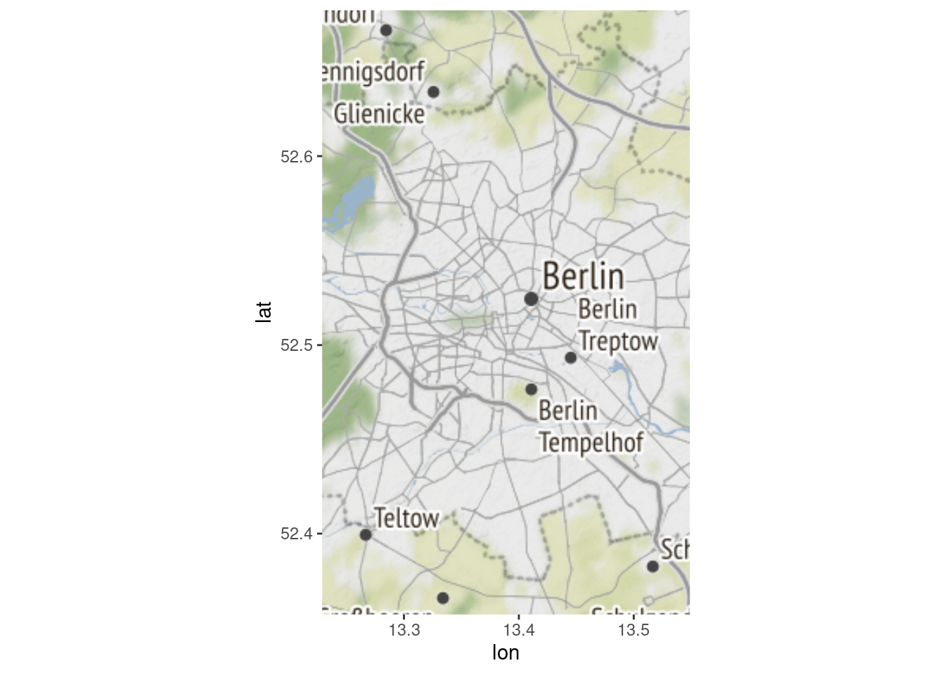
It was never so simple to create a map. However, now we want to do some tailoring. So far, we have used the default option in every function, meaning that we did not specify anything. There are a lot of options and details that can be set.
First, we want to change the area that is covered. One way to do this is
to manually define the area you want to cover by specifying the
coordinates in the get_map() function. Our first map showed the
longitude and latitude as axes in the graph. So, now you have an idea of
how “high,” “low,” “right” and “left” you want to go.
Define a box vector and then repeat the steps.
### make map bigger (manually)
berlin_coordinates <- c(left = 12.95, bottom = 52.35, right = 13.6, top = 52.6)
berlin_images <- get_map(berlin_coordinates)
berlin_map <- ggmap(berlin_images)
berlin_map
So far, so good. But now we want to actually display something on the map that aides our analysis. We will show the location of universities. To do that we need a dataset of universities and their locations. We will just create it here (Yes, I manually copy-pasted the coordinates). Normally, you would download this type of data somewhere online. To create our dataset of universities, I am applying the data management skills we learned in previous sessions:
### step 4: plot coordinates onto map

# generate dataset of university locations
fuberlin <- c(lat=52.4542,lon=13.2928)
potsdam <- c(lat=52.40048,lon=13.01277)
huberlin <- c(lat=52.51893, lon= 13.39257)
tuberlin <- c(lat=52.5139, lon=13.3261)

unis <- data.frame(fuberlin, potsdam, huberlin, tuberlin) %>%
    t() %>%
    as.data.frame() %>% rownames_to_column("university")

unis <- unis %>% mutate(students = case_when(
                        university=="fuberlin"  ~ 70000,
                        university=="huberlin" ~ 80000,
                        university=="tuberlin" ~ 50000,
                        university=="potsdam" ~ 40000,
                        TRUE ~ NA_real_)) %>%
                 mutate(university = case_when(
                   university=="fuberlin"  ~ "FU Berlin",
                   university=="huberlin" ~ "HU Berlin",
                   university=="tuberlin" ~ "TU Berlin",
                   university=="potsdam" ~ "Uni Potsdam",
                   TRUE ~ NA_character_))

str(unis)
## 'data.frame': 4 obs. of 4 variables:
## $ university: chr "FU Berlin" "Uni Potsdam" "HU Berlin" "TU Berlin"
## $ lat : num 52.5 52.4 52.5 52.5
## $ lon : num 13.3 13 13.4 13.3
## $ students : num 70000 40000 80000 50000Now, we layer our information on universities onto our background map
which we defined earlier. First, we apply ggmap() based on the
berlin_images object and then we simply add the geom_point()
function (like we did in previous weeks). Note that the
geom_point() now also has a data= option where we put in the
university dataset. In the end, we are using two datasets at the same
time.
# plot location of universities
ggmap(berlin_images) +
  geom_point(aes(x=lon, y=lat), data=unis)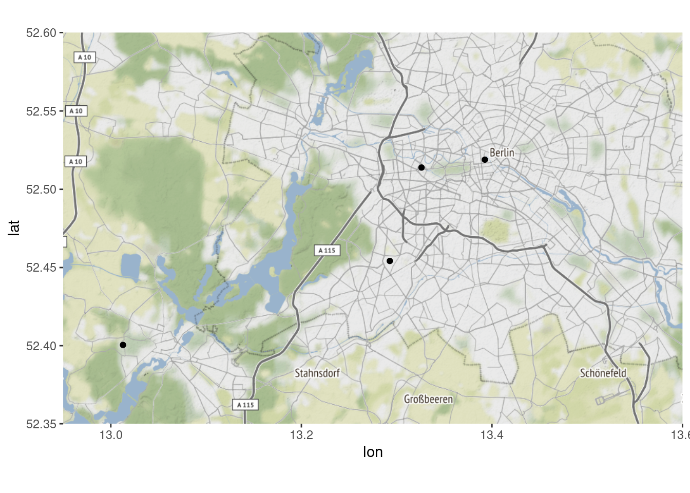
It works. Now let’s increase the size a little bit.
# increase size
ggmap(berlin_images) +
  geom_point(aes(x=lon, y=lat, size=11), data=unis) +
  geom_text(aes(label=university, vjust=2), data=unis)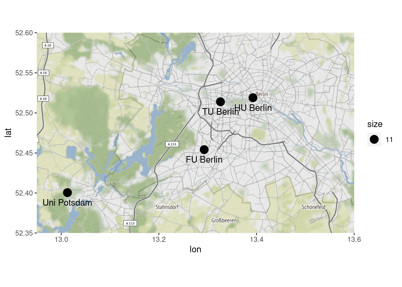
Finally, let’s apply some ggplot() style customization – the kind
we have come to love from previous sessions: Here, we first adjust the
points’ size to display the respective university’s student population
and color them red. Then, we label the points, make sure that color
doesn’t appear in the legend and specify what we want to have as titles
etc. Finally, we remove the axis texts and ticks so that the map is
freestanding and easier on the eyes.
# customize: labels, no axis labels, label dots, color dots
ggmap(berlin_images) +
  geom_point(aes(x=lon, y=lat, size=students, color="red"), data=unis) +
  geom_text(aes(label=university, vjust=2), data=unis) +
  guides(color=FALSE) +
  labs(size="# of students",
       title= "My first awesome map",
       subtitle= "Universities in the region, by size",
       caption= "Uni of Potsdam, 2021") +
  xlab("") +
  ylab("") +
  theme(axis.text.x=element_blank(),
      axis.ticks.x=element_blank(),
      axis.text.y=element_blank(),
      axis.ticks.y=element_blank())
## Warning: `guides(<scale> = FALSE)` is deprecated. Please use `guides(<scale> =
## "none")` instead.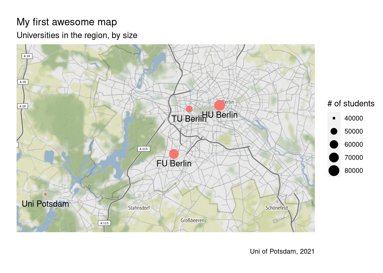
We can also change the look altogether by using a different type of
background map. Look at the options using ?get_stamenmap().
# change look of map altogether
berlin_images <- get_stamenmap(berlin_coordinates, maptype = "toner-lite")
ggmap(berlin_images) +
  geom_point(aes(x=lon, y=lat, size=students, color="red"), data=unis) +
  geom_text(aes(label=university, vjust=2), data=unis) +
  guides(color=FALSE) +
  labs(size="# of students",
       title= "My first awesome map",
       subtitle= "Universities in the region, by size",
       caption= "Uni of Potsdam, 2021") +
  xlab("") +
  ylab("") +
  theme(axis.text.x=element_blank(),
        axis.ticks.x=element_blank(),
        axis.text.y=element_blank(),
        axis.ticks.y=element_blank())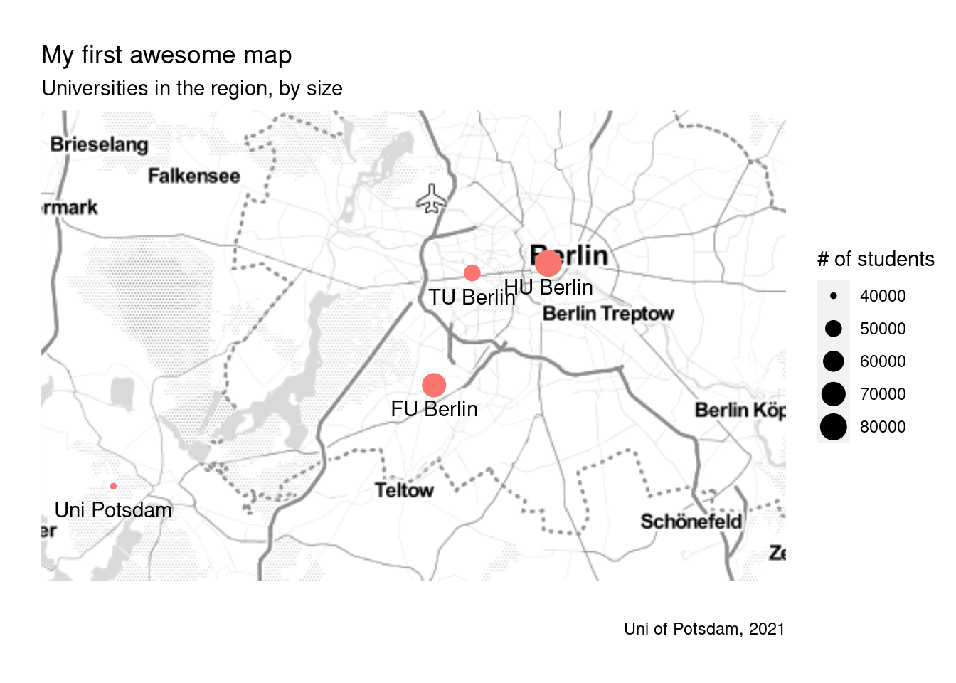
9.2.2 Qmplot Package
There is an alternative way to plot locations based on longitude and
latitude coordinates and getting the background map in one sweep. One
which saves some time because it takes care of both downloading the map
data and displaying it. However, the downside to this package is that
you may miss out on some fancier customization hacks. Let us explore
this package by checking out the qmplot() function qmap()(?qmap).
In this code below, we call on the latitude and longitude columns in the unis dataset for the x and y axes in the plot. Recall that this
means working with the coordinates of the four universities as
individual ‘spots’ rather than specifying an area. We define the type of
background map as “terrain.” We tell qmplot() that we want to
plot the university locations as “dots” (geom_point="point").
We want the color to reflect the number of students at each university
(color = students) and fix the size of the bubbles (size=12).
The default color scale in qmplot() is blue. The argument
scale_color_gradient(low = "blue", high="red") changes the color
scale from shades of blue to red; i.e. red shows unis with more, blue
with fewer students.
## Alternative:: Get background map based on existing lon/lat coordinates in data
?qmplot

# qmplot
qmplot(x = lon, y = lat, data =  unis, maptype = "terrain",
       geom = "point", color=students, size=12) +
  scale_color_gradient(low = "blue", high ="red")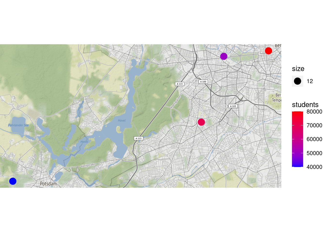
9.2.3 Maps Package, Ggplot2 + geom_polygon()
In our second approach, we want to show a map of the European Union and visualize where students in our dataset come from. Ideally, we want to color the countries differently depending on how many students came from there. This type of map is called a “choropleth” map.
For this exercise, we are going to first install and use the “maps”
package. It provides a large dataset with polygons for all countries and
regions in the world. Using the map_data() function we can easily
import the coordinates for any set of countries. In addition, I filter
out subregions because for many countries, we have the coordinates for
subregions included (think of Scotland in the UK). Keeping these
coordinates in our data would mess up our map later.
# install packages using install.packages("maps") and install.packages("viridis") once and load them
library(maps)
library(viridis)
# define a list of countries we want to map
EU <- c("France", "UK", "Germany", "Spain", "Portugal",
"Italy", "Netherlands", "Belgium", "Denmark",
"Switzerland", "Austria", "Poland", "Czech Republic",
"Croatia", "Slovenia", "Slovakia", "Bulgaria",
"Romania", "Hungary", "Finland", "Sweden")
# import map data (only for the countries in the list)
europe <- map_data("world", region=EU) %>%
filter(is.na(subregion) | subregion=="Great Britain")Now, we simply use the ggplot() function to plot the map. The values
for longitude and latitude are the x and y values (similar to scales in
a scatterplot). We use the group= option and tell R which
coordinates belong to the same country, thereby forming the boundaries
of that country. The group variable in the “Europe” dataframe has the
same number for all coordinates belonging to the same country. The
fill= argument selects the colors of the countries and the color = option selects the color of the boundaries between countries.
# plot base map of countries using polygons
ggplot(europe, aes(x = long, y = lat, group = group)) +
geom_polygon(fill="lightgray", colour = "white")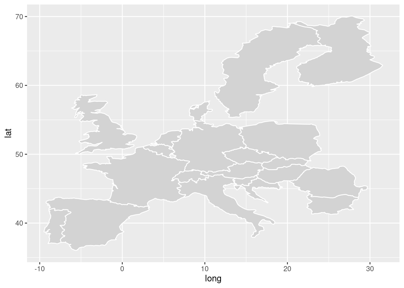
Now, we want to use some of our data to be displayed in the map. Let’s
create a new dataset containing the number of students enrolled at the
university by their respective country of origin. Here, we need to be
careful because our merging variable of interest – the country names –
are not named the same in the new origin and europe datasets. Then we
merge that data into our data frame containing all the geo-data. Once
that is done, we add the variable that indicates whether students
come from the country of interest to the fill= argument. We use the
available variable we just created to exclude NA observations.
## now merge other info from our dataset
# prepare data
origin <- students %>% group_by(cob) %>% summarise(students = n())

# merge data
studentorigin <- merge(origin, europe, by.x="cob", by.y="region", all=TRUE) %>%
  mutate(available = case_when(!is.na(students) ~ 1,
                               TRUE ~ 0)) %>%
  mutate(available = as.factor(available)) %>%
  arrange(order)

# Plot with countries where students are from
ggplot(studentorigin, aes(x = long, y = lat, group=group)) +
geom_polygon(aes(group=group, fill=available), color="white") 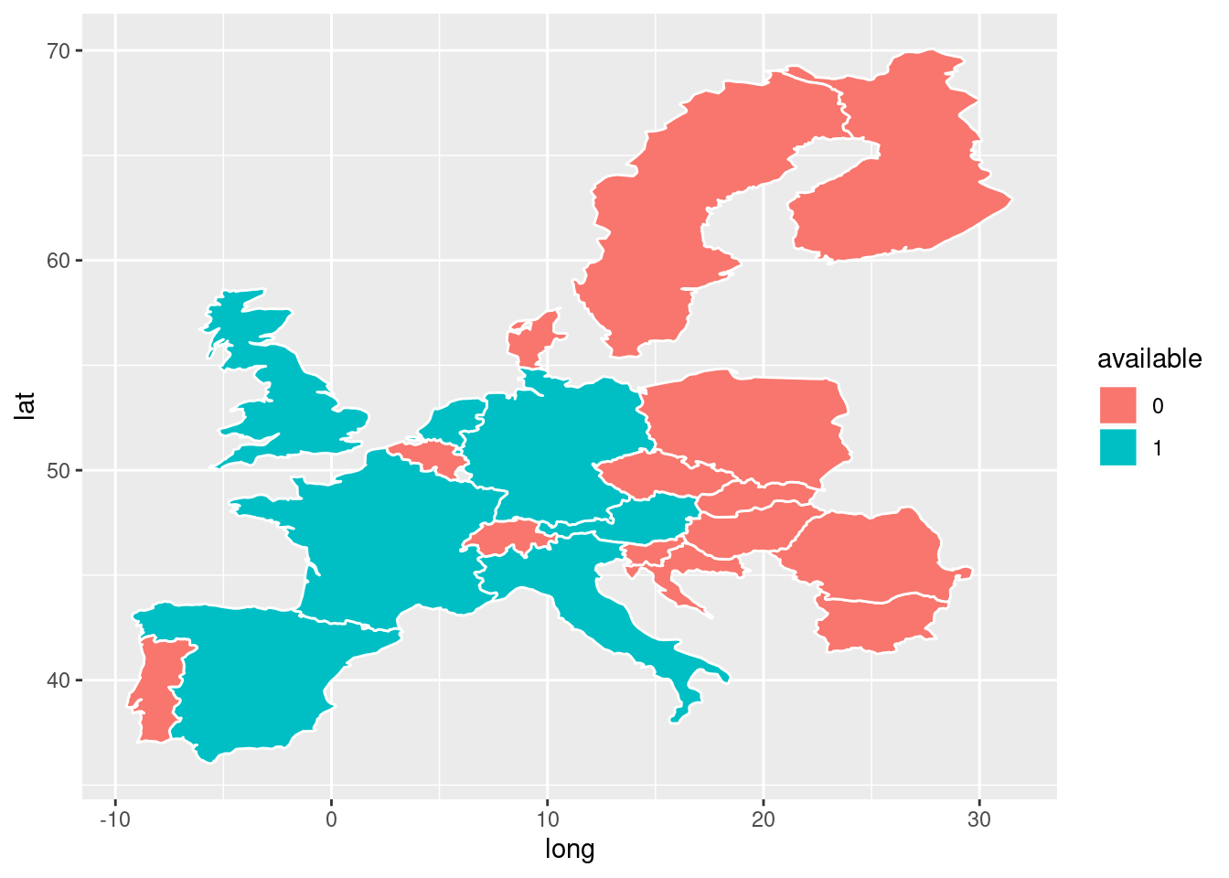
# Plot color by how many student come from there
ggplot(studentorigin, aes(x = long, y = lat, group=group)) +
geom_polygon(aes(group=group, fill=students), color="white") 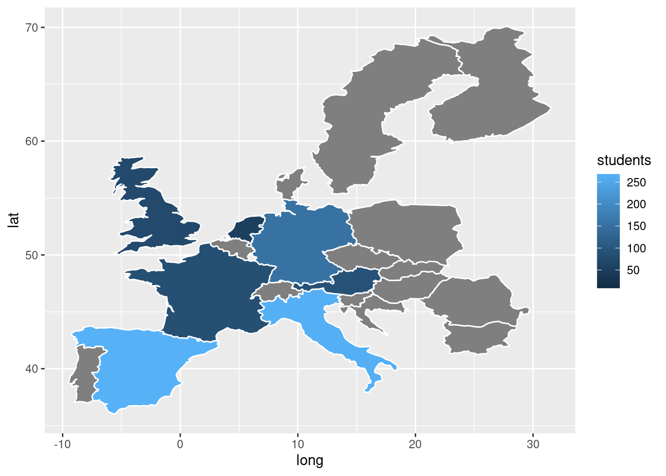
Now, we also want to display the number of students from each country inside each country. This requires some extra steps. Our dataset currently has many rows for one country (i.e. many coordinates for the boundaries). We want to display the number of students in the middle of each country. Currently, we do not have that coordinate. We can get an approximation of the centroid (middle of a map) by simply averaging the coordinates by country. It is not perfect but works in some cases.
# let's try to add the number for each country
studentorigin1 <- studentorigin %>% group_by(cob, group, students) %>%
  summarise(long = mean(long, na.rm = TRUE),
             lat = mean(lat, na.rm = TRUE))
Now, just like we did in previous sessions, we add the geom_text()function. Note that this function now uses a different dataset than in
the ggplot() argument. VoilC , does not look bad at all.
ggplot(studentorigin, aes(x = long, y = lat)) +
  geom_polygon(aes(group=group, fill=students), color="white") +
  geom_text(data = studentorigin1, mapping = aes(x=long, y=lat, label=students)) +
  labs(fill="# of students",
       title= "Student origin",
       subtitle= "Number of students by country of origin",
       caption= "Uni of Potsdam, 2021")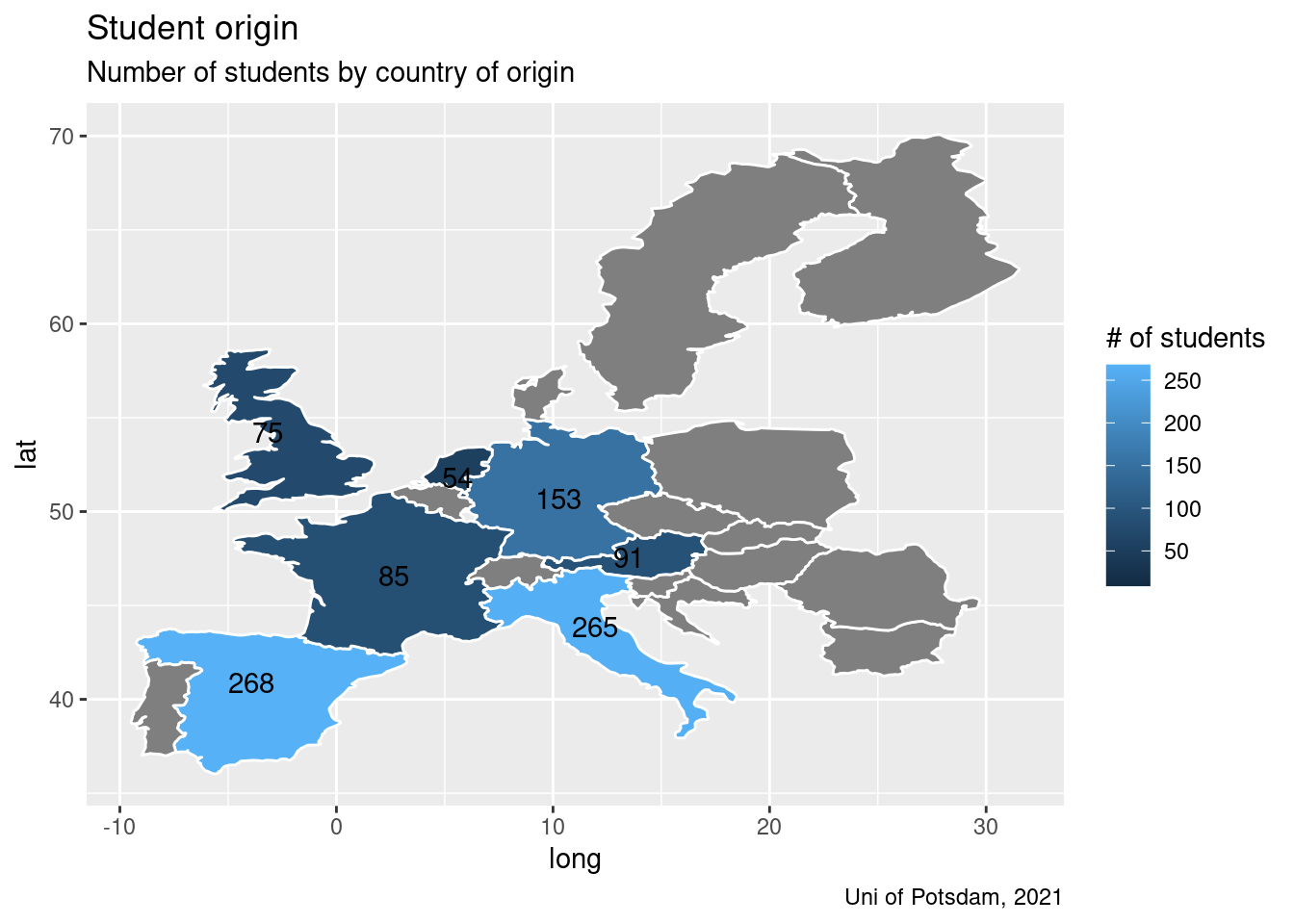
Tip: In case you need a quick refresher sometime in the future or just want a good summary of what you have learned so far including things you have not learned but might be good to know, click here to see ggplot's cheat sheet.
9.3 Exercises I (based on class data)
Last week, the Board of Education seemed mildly impressed by your visualization skills. To truly knock them off their socks, you need to do up your game. One task in the past was to show the distribution of term durations by country of origin. Back then, we used graphs. Since we learned to visualize maps this week, we should also be able to map the mean term duration per country of origin! Also, your employer will probably be impressed by the sudden increase in your skills.
Plot the mean term duration per country of origin.
First, you need to create a dataframe of Europe containing the coordinates of every country. For that subtask, you will first need to produce a character vector with the European country names.
Next, instead of counting the number of students by country, please get the mean term duration by country. Don’t forget to exclude NA values.
Now you need to merge the two dataframes. Don't forget to arrange the order of the coordinates, unless you desire a sketchy map.
All you need to do now is to do the mapping. Don’t forget to make it look pretty: exclude axes ticks and text, label the gradient box, think of concise title.
Your employer and the Board of Education are very pleased with your results. To mark the occasion, they invite you to your favorite food place. However, that is not quite the end of the story already. There is one last test: They want you to list four different food places and map the University of Potsdam and your favorite food places in Potsdam/Berlin. You don’t know why you would need to do such a thing if you could just use Google Maps to produce the same image, but you suspect there is more to this than one might think, so you just abide.
First, you need to create a map of Berlin.
Now It is time to get the coordinates of the University of Potsdam and your 4 favorite food places. Choose any places in or between Berlin and Potsdam.
Lastly, you must merge these two vectors to create a dataframe.
Don’t forget to make the plot “pretty!” (see definition above)
9.4 Exercises II (based on your own data)
Plot a specific location on a map that could be relevant to your project/ dataset. For example, if you have education data, plot the location of a school. If you have country data, plot a capitol, and so on.
If your data includes information on countries (or you could aggregate to the country level), go ahead and produce a heat map containing any relevant information across country. If your dataset does not include data on countries, find data online and create a map for countries. Hint: the gapminder dataset is a good one.