8 Week 8: More (complex) graphs
Objective of this session:
Learn how to visualize more than 2 variables at a time
Learn how to tailor your graph and make it look beautiful
Learn about options for graph types that you may not have heard about
R commands covered in this session:
Ggplot()
Ggalluvial()
Ggridges()
theme()
fct_reorder()
8.1 Intro
Last week, you learned how to do fairly simple charts using one and two variables including bar charts, scatterplots, box-plots and line graphs. For most practical cases, this is enough. The more complex your graph, the more difficult it is to get your main message across. Visualizations are the art of finding that sweet spot between focusing on your message and making it look appealing. If your graph is too simple, a table may serve just as well. However, if your chart is too complex, you may lose your audience.
This week we are going to kick it up a notch in terms of complexity and have some fun with fancier visuals.
We are going to visualize more than two variables at a time. Step-by-step, we will first produce a scatterplot that displays information from 6 variables. The step-wise approach will introduce you to the range of options that you have to fine-tune any type of graph.
Second, we will produce a stacked and grouped bar chart considering 5
variables (What!? ….Exactly). Again, this one chart is just an
example to make you more familiar with the range of options in
ggplot().
As we build both plots, we will learn how to further customize our graphs a lot more to make them look better. This gets a little tedious, but it is worth it!
Finally, I will show you some more exotic graphs you may not know of, but are actually really cool (including alluvial plots, ridgeline chars, and the lollipop chart).
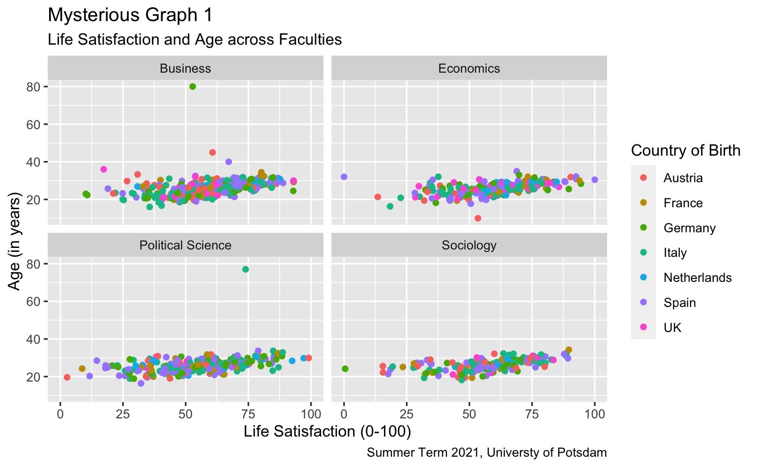
8.2 A Scatterplot on Steroids
Remember the scatterplot we built last week with the students data? Here it is again.
# Scatterplot with 5 variables
scatter2 <- students %>% filter(age<40 & age>16) %>%
  ggplot(aes(x=as.numeric(lifesat), y= age))+
    geom_point()
scatter2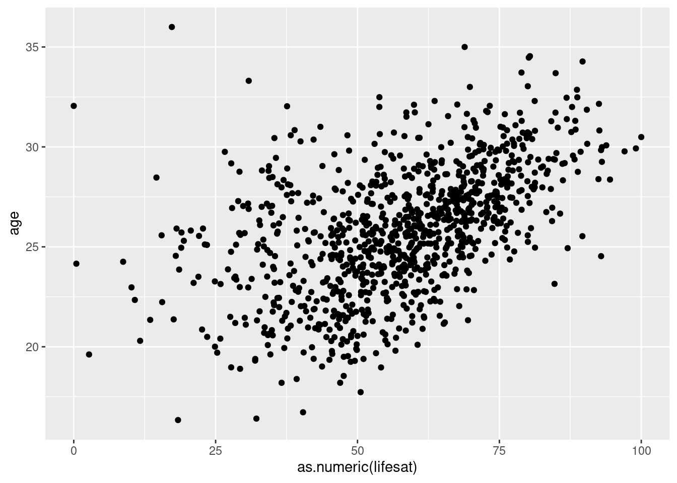
8.2.1 Adding Information from Additional Variables
8.2.1.1 Changing Shape of Dots
Now, we can change the look of the dots. For example, we can adjust
their shape by another variable, the default option is simply a bubble.
Each dot in our case is a student. The y and x axis show the age and the
life satisfaction. When we use aes(shape=sex) inside
geom_point(), we tell R to use separate shapes (instead of bubbles)
for male and female students:
# change shape of dots by another variable
scatter2 <- students %>% filter(age<40 & age>16) %>%
  ggplot(aes(x=as.numeric(lifesat), y= age))+
    geom_point(aes(shape=sex))
scatter2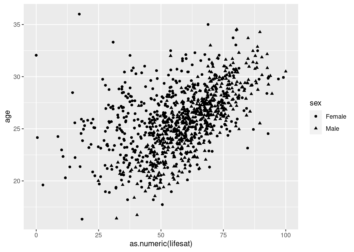
8.2.1.2 Changing the Size of Dots
We can also adjust the size of the dot. Let’s add size=term to
geom_point() and we see that the size of each dot is now relative
to the number of terms that students have completed. When we look
closer, we see however, that our term variable is messed up. It does not
count up from 0. Note, that we use theme(legend.text=..., legend.key.size=...) to reduce the size of the text and symbols in the legend so that they are fully displayed and not cut off.
# vary the size of the dots by another variable
scatter2 <- students %>% filter(age<40 & age>16) %>%
  ggplot(aes(x=as.numeric(lifesat), y= age))+
  geom_point(aes(shape=sex, size = term)) +

  theme(legend.text=element_text(size=rel(0.6)), legend.key.size = unit(0.25,"line"))
scatter2
## Warning: Using size for a discrete variable is not advised.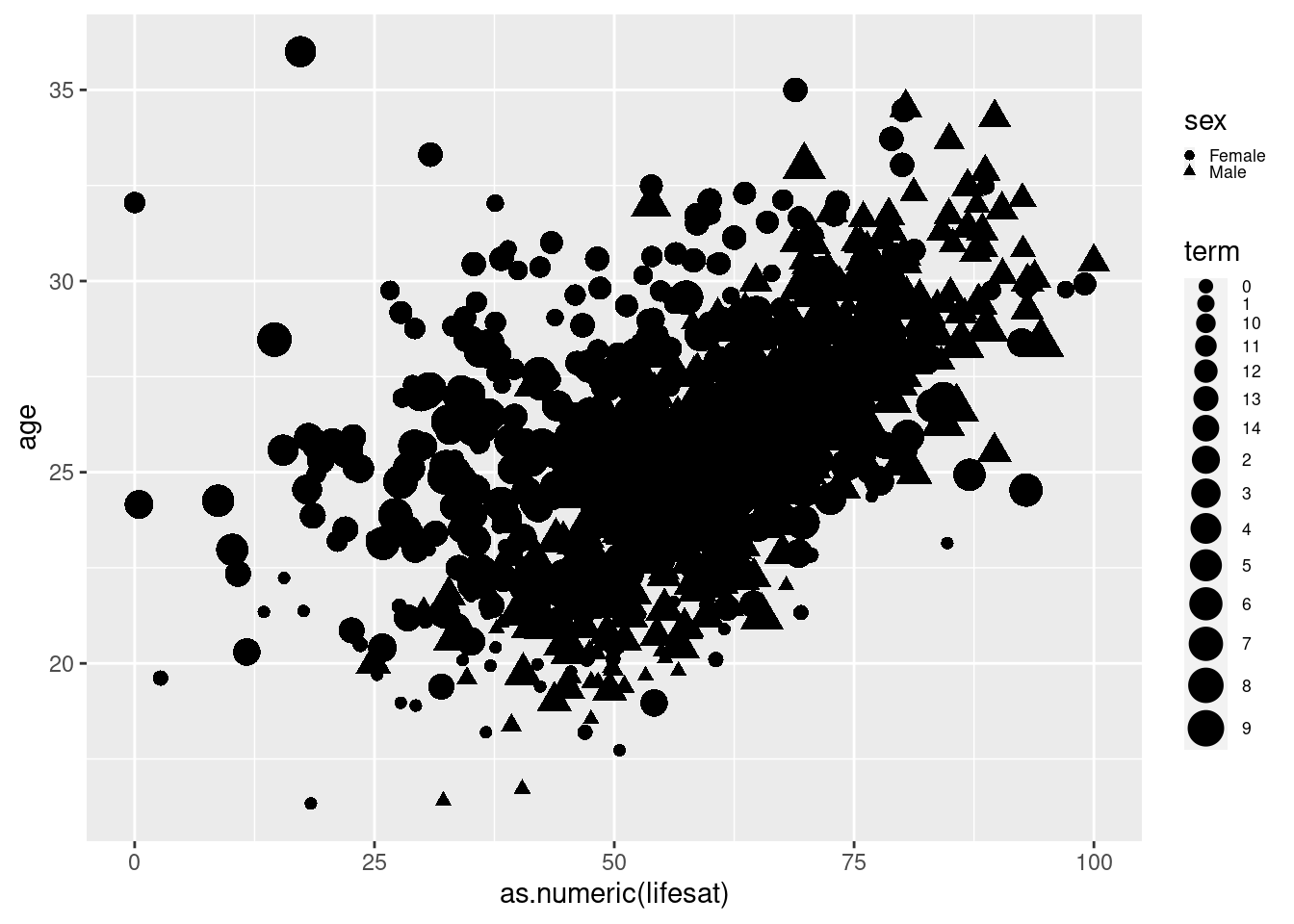
We should turn our term variable into a factor variable, so R knows
that it should be sorted. Before turning the character variable into a
factor variable, we need to turn it into a numeric variable to tell R
that the values are actually numbers. After we do that and plot it
again, it looks like younger students are also those in earlier terms
(which makes sense).
Note: You can change the type of variable before plotting or within the
ggplot() command. If you use the as.numeric() function in the
mutate() function, then the variable is permanently changed. If you
apply it in the ggplot(), you convert it only temporarily and the
changes are not saved.
# fix "term" variable
scatter2 <- students %>%

  mutate(term = as.factor(as.numeric(term))) %>%

  filter(age<40 & age>16) %>%

  ggplot(aes(x=as.numeric(lifesat), y= age))+

    geom_point(aes(shape=sex, size = term))+

  theme(legend.text=element_text(size=rel(0.6)), legend.key.size = unit(0.25,"line"))

scatter2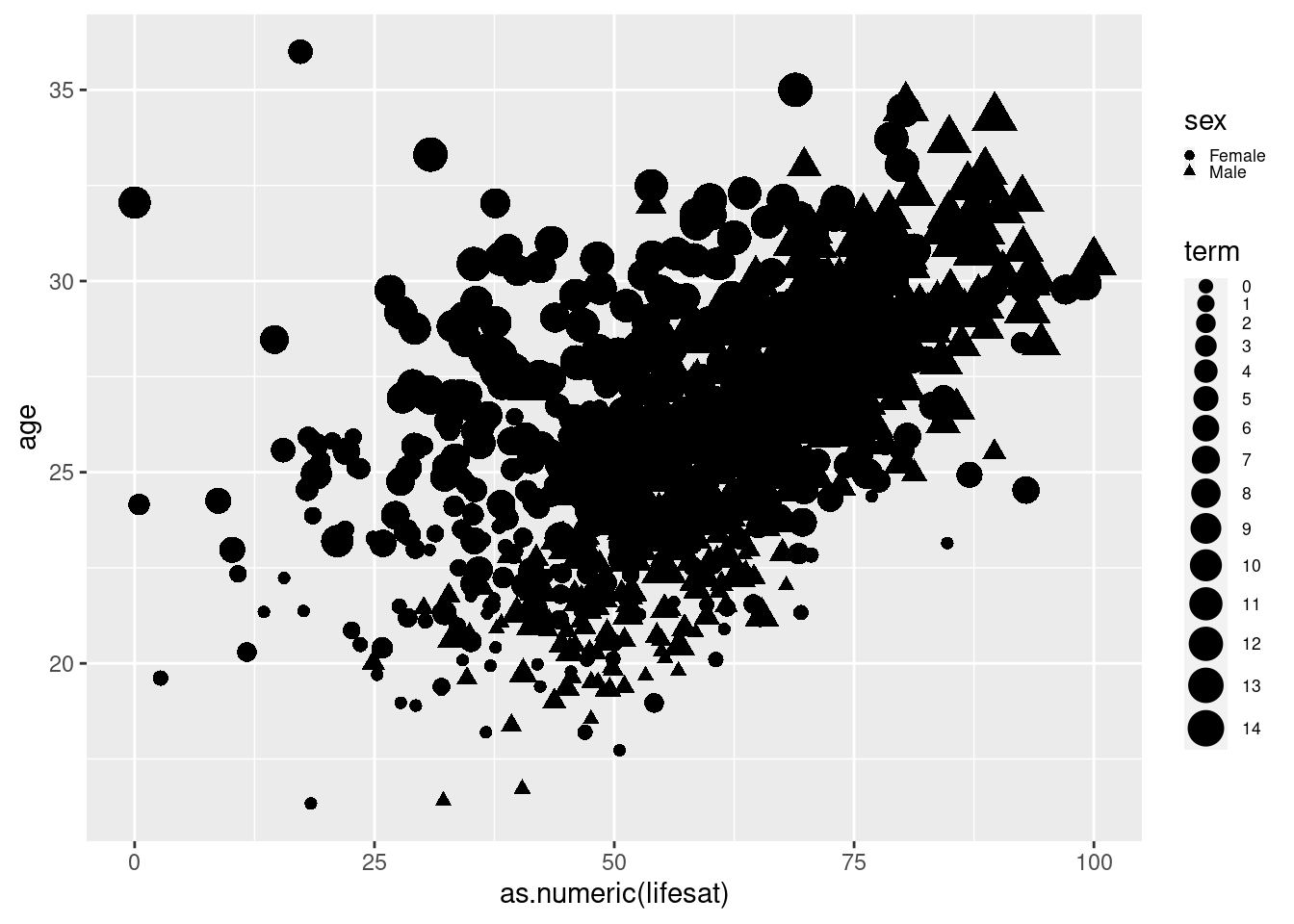
8.2.1.3 Change Color of Dots
We have adjusted the shape and the size. Now, let’s adjust the color.
Again, this is done in the same way by adding an argument to
geom_point(). Color=job tells R to put each category of the job
variable into a different color.
# distinguish color by another variable
scatter2 <- students %>%

  mutate(term = as.factor(as.numeric(term))) %>%

  filter(age<40 & age>16) %>%

  ggplot(aes(x=as.numeric(lifesat), y= age)) +

    geom_point(aes(shape=sex, size = term, color=job)) +

  theme(legend.text=element_text(size=rel(0.6)), legend.key.size = unit(0.25,"line"))

scatter2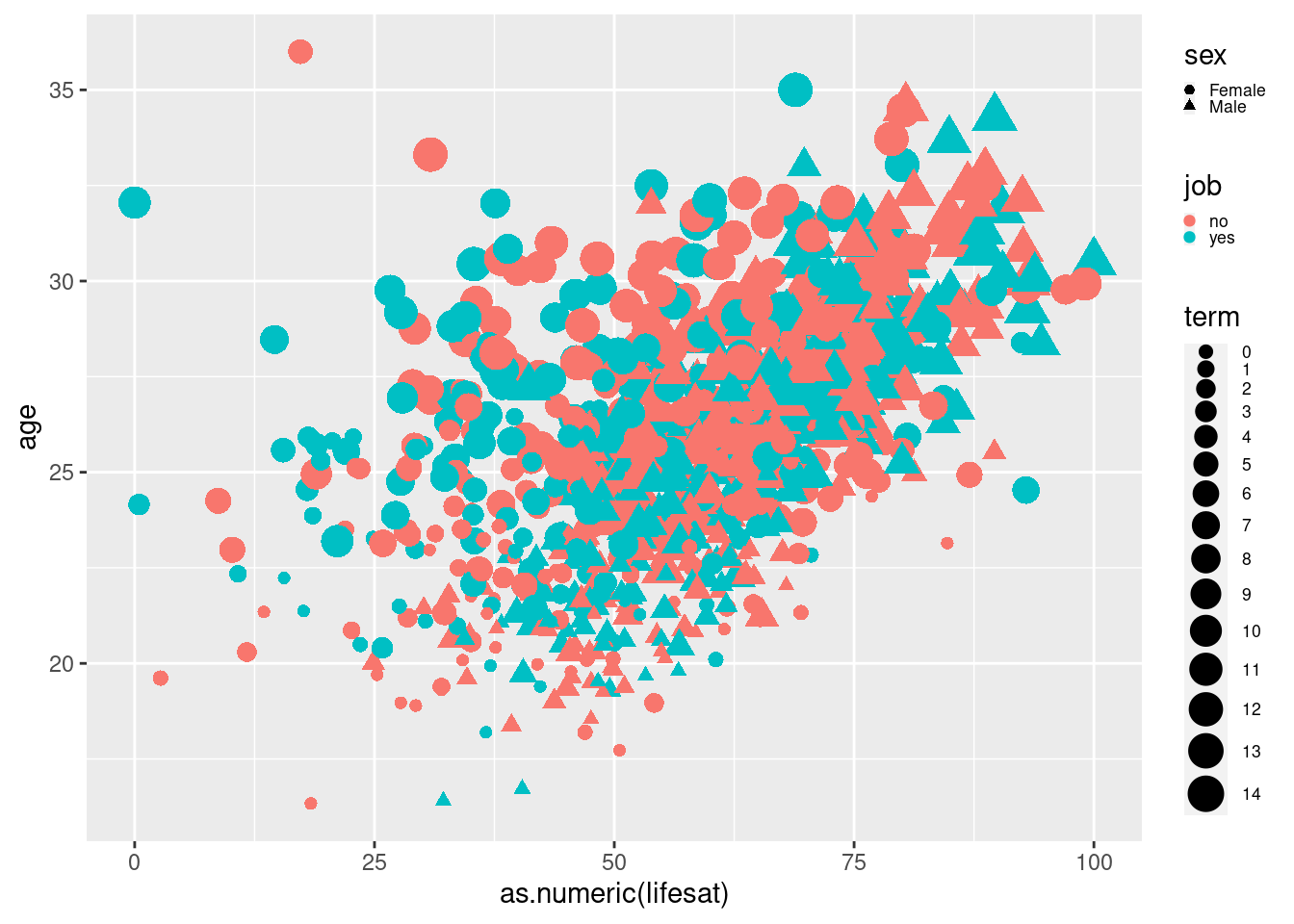
8.2.1.4 Spit Graphs by Another Variable
Currently, we display information from five variables. Let’s make it six
by splitting the graph by another variable using
facet_wrap(vars()). We now have the previous graph for each
faculty. ncol=2 tells R to arrange the plots in 2 columns.
# split graph into separate graphs
# by faculty, control layout
scatter2 <- students %>%

  mutate(term = as.factor(as.numeric(term))) %>%

  filter(age<40 & age>16) %>%

  ggplot(aes(x=as.numeric(lifesat), y= age))+

    geom_point(aes(shape=sex, size = term, color=job)) +

    facet_wrap(vars(faculty), ncol = 2) +

  theme(legend.text=element_text(size=rel(0.6)), legend.key.size = unit(0.25,"line"))

scatter2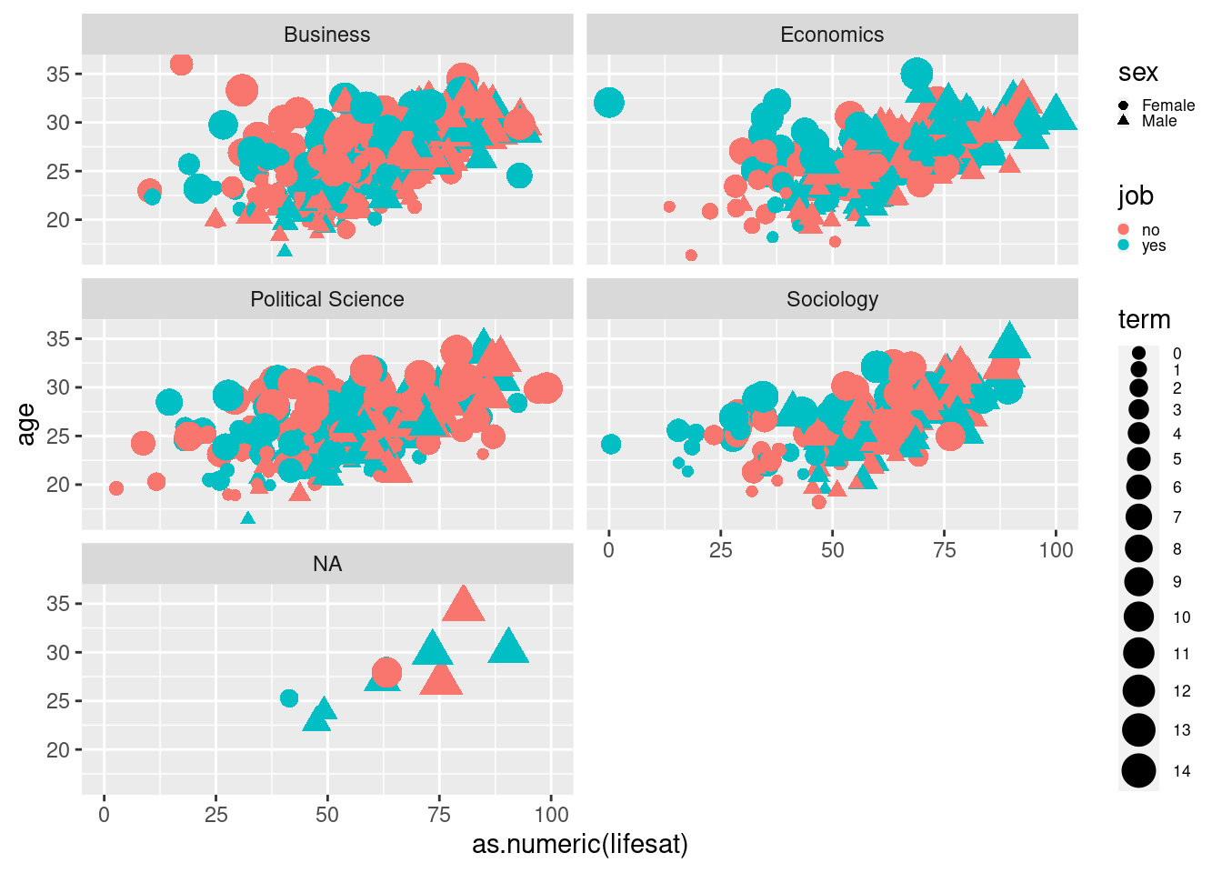
8.2.2 Customizing the Look of Graphs
So far so good. Now, we will use this graph as a basis for further customization.
First: Let’s change the names of axis labels, add a title, and a
subtitle using labs(), xlab() and ylab().
8.2.2.1 Add Axis Labels and Titles
# add labels
scatter2 <- students %>%
  mutate(term = as.factor(as.numeric(term))) %>%
  filter(age<40 & age>16) %>%
  ggplot(aes(x=as.numeric(lifesat), y= age))+
    geom_point(aes(shape=sex, size = term, color=job)) +
    facet_wrap(vars(faculty), ncol = 2) +
    labs(
      title = "Scatterplot",
      subtitle = "6 variables in one chart") +
    xlab("Life Satisfaction (0-100") +
    ylab("Age (in years)") +

  theme(legend.text=element_text(size=rel(0.6)), legend.key.size = unit(0.25,"line"))

scatter2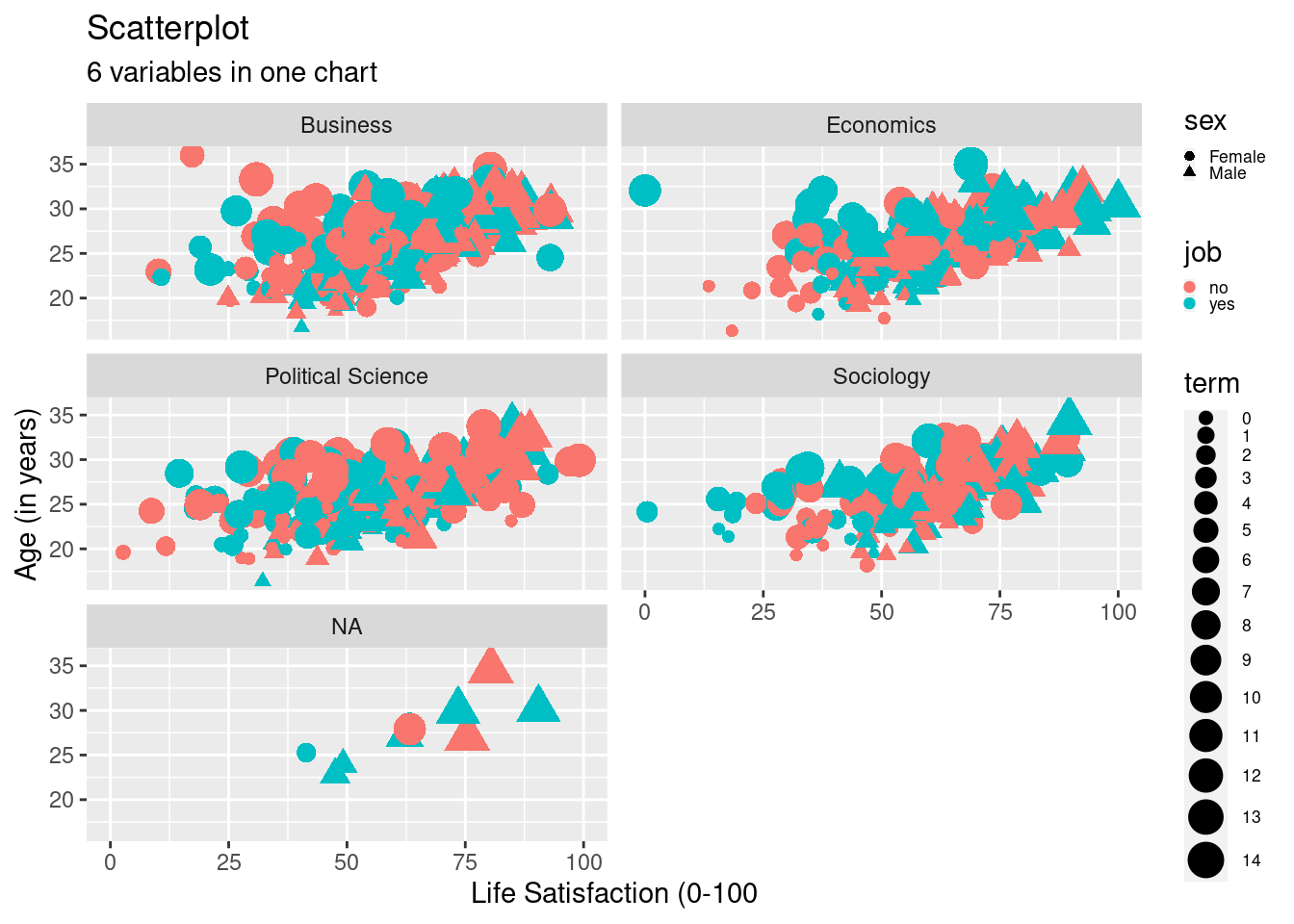
8.2.2.2 Change Scales
Next, let’s change the start and end of both axes using
scale_y_continuous() and scale_x_continuous() in combination
with limits=. Here, we specify the y-axis, which displays age,
that it should range from 18 to 35 and x-axis displaying lifesat
should range from 5 to 95. Do you notice any other changes in the code?
What are they and what has changed in the graph?
# change y and x scales
scatter2 <- students %>%
  mutate(term = as.factor(as.numeric(term))) %>%
  filter(age<40 & age>16, !is.na(faculty)) %>%
  ggplot(aes(x=as.numeric(lifesat), y= age))+
    geom_point(aes(shape=sex, size = term, color=job)) +
    facet_wrap(vars(faculty), ncol=2) +
    labs(
      title = "Scatterplot",
      subtitle = "6 variables in one chart") +
    xlab("Life Satisfaction (0-100)") +
    ylab("Age (in years)") +
    scale_y_continuous(limits=c(18,35)) +
    scale_x_continuous(limits=c(5,95)) +

  theme(legend.text=element_text(size=rel(0.6)), legend.key.size = unit(0.25,"line"))
scatter2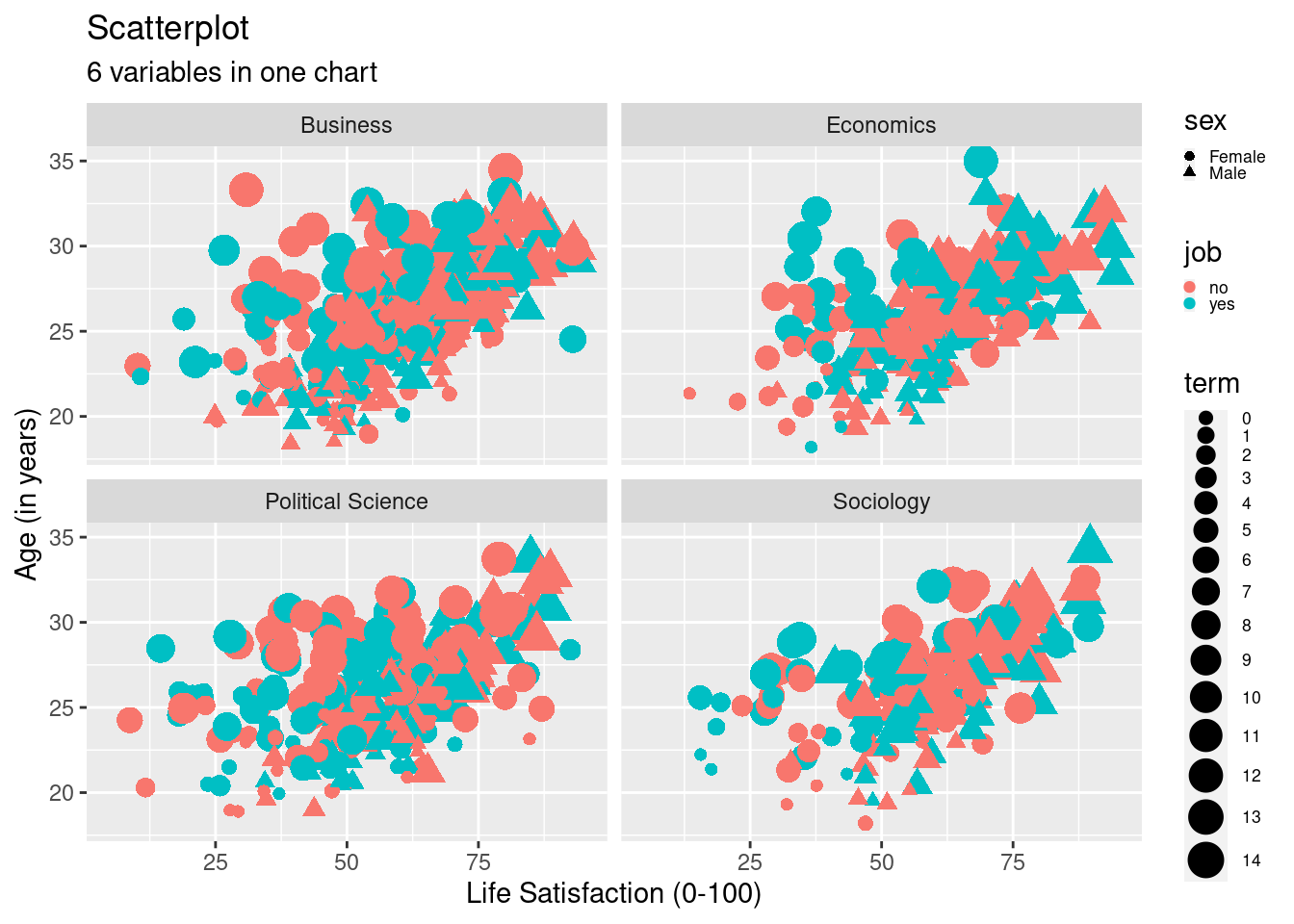
8.2.2.3 Change Legend Labels
With six different variables in our plot, it’s important to let readers (and your future self!) know which aspect of the plot is representative of which variable. This is why we introduce a legend.
Let’s also add a caption and change the title of the legends using
labs(). Using theme (plot.caption = element_text(hjust = 0, face= "italic")), we move the caption to the left side and make it
cursive. Here, the hjuststands for horizontal justification,
similarly you can adjust the vjust(you guessed it: vertical
justification).
# label legends, add caption, change caption position:
?labs
scatter2 <- students %>%
  mutate(term = as.factor(as.numeric(term))) %>%
  filter(age<40 & age>16, !is.na(faculty)) %>%
  ggplot(aes(x=as.numeric(lifesat), y= age))+
    geom_point(aes(shape=sex, size = term, color=job)) +
    facet_wrap(vars(faculty), ncol=2) +
    labs(
      title = "Scatterplot",
      subtitle = "6 variables in one chart",
      caption = "Uni Potsdam, 2021",
      size ="Current term",
      shape= "Student's Sex",
      color= "Student's Job Status") +
    xlab("Life Satisfaction (0-100)") +
    ylab("Age (in years)") +
    scale_y_continuous(limits=c(18,35)) +
    scale_x_continuous(limits=c(5,95)) +
    theme(plot.caption = element_text(hjust = 0, face= "italic")) +

  theme(legend.text=element_text(size=rel(0.6)), legend.key.size = unit(0.25,"line"))

scatter2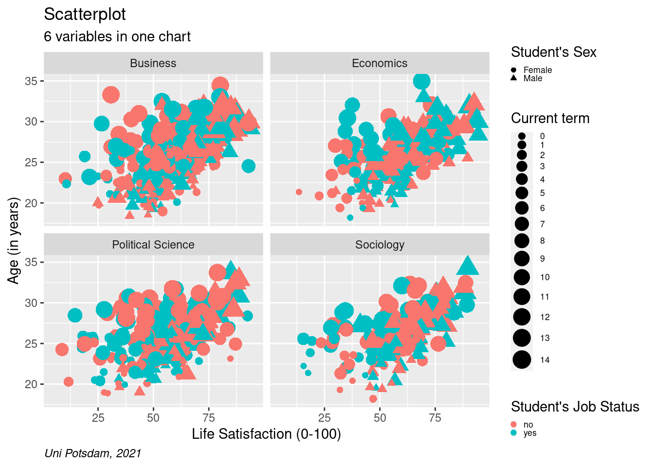
Tip: Remember to check your labels in each graph (in the labs()
argument). As soon as you overwrite the labels of your variables in the
plot, you cannot use their old names anymore. This can happen fairly
easy and happened to me before.
8.2.2.4 Add Linear Trend Line
Sometimes, we want to make the general trend even more obvious to
readers. A linear trend line allows us to do so! Now, let’s add a linear
trend line by using geom_smooth(method="lm"). Lm stands for
linear model. It means that R is fitting a straight
line through the
dots based on a linear regression model (minimizing the total distance
of dots relative to the line). We can also have separate lines for
different groups by adding a breakdown (for example, color=) to the
ggplot() argument. Whatever you add to the ggplot() argument
will be carried over to later arguments. This is why geom_smooth()
automatically calculates lines by job.
# add linear trend line
scatter2 <- students %>%
  mutate(term = as.factor(as.numeric(term))) %>%
  filter(age<40 & age>16, !is.na(faculty)) %>%
  ggplot(aes(x=as.numeric(lifesat), y= age))+
  geom_point(aes(shape=sex, size = term, color=job)) +
  facet_wrap(vars(faculty), ncol=2) +
  labs(
    title = "Scatterplot",
    subtitle = "6 variables in one chart",
    caption = "Uni Potsdam, 2021",
    size ="Current term",
    shape= "Student's Sex",
    color= "Student's Job Status") +
  xlab("Life Satisfaction (0-100)") +
  ylab("Age (in years)") +
  scale_y_continuous(limits=c(18,35)) +
  scale_x_continuous(limits=c(5,95)) +
  theme(plot.caption = element_text(hjust = 0, face= "italic")) +
  geom_smooth(method="lm") +
  theme(legend.text=element_text(size=rel(0.6)), legend.key.size = unit(0.25,"line"))

scatter2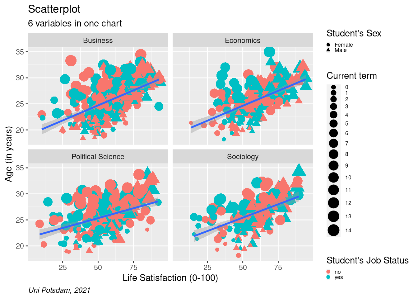
# add lines by group (move group to ggplot())
scatter2 <- students %>%
  mutate(term = as.factor(as.numeric(term))) %>%
  filter(age<40 & age>16, !is.na(faculty)) %>%
  ggplot(aes(x=as.numeric(lifesat), y= age, color= job))+
  geom_point(aes(shape=sex, size = term)) +
  facet_wrap(vars(faculty), ncol=2) +
  labs(
    title = "Scatterplot",
    subtitle = "6 variables in one chart",
    caption = "Uni Potsdam, 2021",
    size ="Current term",
    shape= "Student's Sex",
    color= "Student's Job Status") +
  xlab("Life Satisfaction (0-100)") +
  ylab("Age (in years)") +
  scale_y_continuous(limits=c(18,35)) +
  scale_x_continuous(limits=c(5,95)) +
  theme(plot.caption = element_text(hjust = 0, face= "italic")) +
  geom_smooth(method="lm")+
  theme(legend.text=element_text(size=rel(0.6)), legend.key.size = unit(0.25,"line"))

scatter2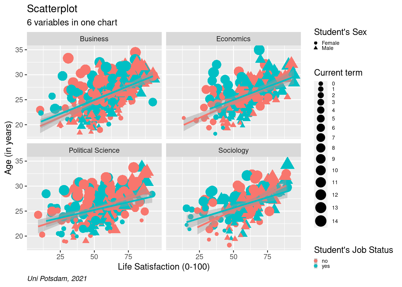
8.2.2.5 Change Themes (the Overall Look)
We have used default themes in ggplot() before. ggplot()
provides us with a nice range of built-in themes that we can add at the
end of the graph using theme_??() where ?? is a placeholder for
the name of the theme you choose. You can check out the themes
here.
ggplot() follows a sequential logic which means (in most cases) that
things that you add later will overwrite things you added earlier. So
here, we add theme_minimal() to get a whole new look for the graph,
after which we manually define where the caption should be positioned.
Every aspect and little detail in any plot can be manually changed. It
gets quite complex and long very quickly.
Tip: Use ggplot() ggthemes() or additional packages to adjust
the look of graph. Doing everything manually can be stressful at this stage.
If you want to be a designer, layouter, or data journalist, it definitely is worth investing in further customization and to learn how to create your own standard themes. For example. The BBC uses R for visualizations and came up with their own look.
If you are interested, here is a good start for exploring further.
# change overall look
scatter2 <- students %>%
  mutate(term = as.factor(as.numeric(term))) %>%
  filter(age<40 & age>16, !is.na(faculty)) %>%
  ggplot(aes(x=as.numeric(lifesat), y= age, color= job))+
    geom_point(aes(shape=sex, size = term)) +
    facet_wrap(vars(faculty), ncol=2) +
    labs(
      title = "Scatterplot",
      subtitle = "6 variables in one chart",
      caption = "Uni Potsdam, 2021",
      size ="Current term",
      shape= "Student's Sex",
      color= "Student's Job Status") +
    xlab("Life Satisfaction (0-100)") +
    ylab("Age (in years)") +
    scale_y_continuous(limits=c(18,35)) +
    scale_x_continuous(limits=c(5,95)) +
    geom_smooth(method="lm") +
    theme_minimal() +
    theme(plot.caption = element_text(hjust = 0, face= "italic"))+
    theme(legend.text=element_text(size=rel(0.6)), legend.key.size = unit(0.25,"line"))

scatter2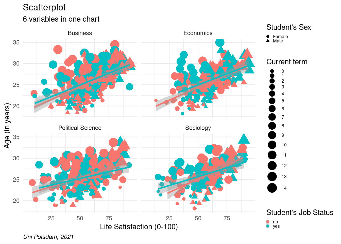
8.2.2.6 Add Text using geom_text()
Sometimes, you want your plot to “say” (illustrate) even more
(information) to the reader and you decide to include some text in your
graphic using geom_text(). In this example, we label the data
points (which represent students) with their respective age. To be fair,
this does not make our specific plot more meaningful, but now we know
how to add labels in the plot when we want to! You have probably seen an
example of this in cross-country comparisons where the bubbles are
labeled with their country names – so if our imaginary students data
provided us with names, we could use this to label each bubble more
meaningfully.
# add text to the graph
scatter2 <- students %>%
  mutate(term = as.factor(as.numeric(term))) %>%
  filter(age<40 & age>16, !is.na(faculty)) %>%
  ggplot(aes(x=as.numeric(lifesat), y= age, color= job))+
    geom_point(aes(shape=sex, size = term)) +
    facet_wrap(vars(faculty), ncol=2) +
    labs(
      title = "Scatterplot",
      subtitle = "6 variables in one chart",
      caption = "Uni Potsdam, 2021",
      size ="Current term",
      shape= "Student's Sex",
      color= "Student's Job Status") +
    xlab("Life Satisfaction (0-100)") +
    ylab("Age (in years)") +
    scale_y_continuous(limits=c(18,35)) +
    scale_x_continuous(limits=c(5,95)) +
    geom_smooth(method="lm") +
    theme_minimal() +
    theme(plot.caption = element_text(hjust = 0, face= "italic")) +
    geom_text(aes(label=age))+
    theme(legend.text=element_text(size=rel(0.6)), legend.key.size = unit(0.25,"line"))

scatter2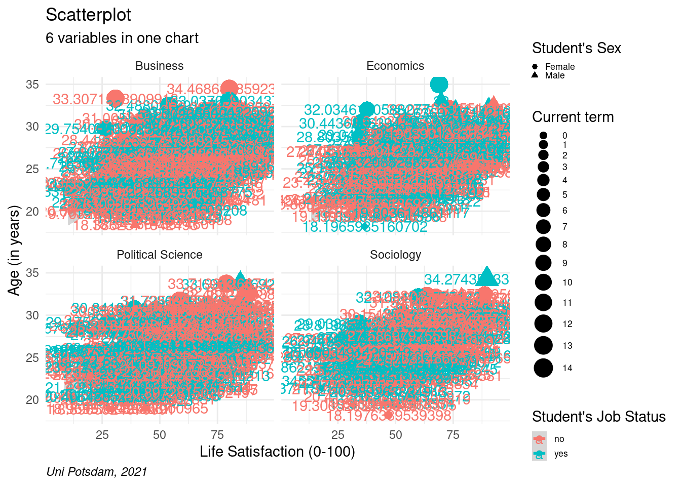
8.2.2.7 Label Outliers
It gets slightly more complicated when we want to label only certain
dots. First, we create a new data frame only containing the outliers.
Then, we use geom_text_repel(), indicate the outliers and define
the label. In aes() we also specify that we want to round the age to
zero decimal places and change the label color to black.
# only outliers and fewer digits
# first create new object including outliers

outliers <- students %>% filter(age>33 | age <25 ,  lifesat>80 | lifesat<25, !is.na(faculty))
# install the ggrepel package using install.packages("ggrepel") and load it
library("ggrepel")scatter2 <- students %>%
mutate(term = as.factor(as.numeric(term))) %>%
filter(age<40 & age>16, !is.na(faculty)) %>%
ggplot(aes(x=as.numeric(lifesat), y= age, color= job))+
geom_point(aes(shape=sex, size = term)) +
facet_wrap(vars(faculty), ncol=2) +
labs(
title = "Scatterplot",
subtitle = "6 variables in one chart",
caption = "Uni Potsdam, 2021",
size ="Current term",
shape= "Student's Sex",
color= "Student's Job Status") +
xlab("Life Satisfaction (0-100)") +
ylab("Age (in years)") +
scale_y_continuous(limits=c(18,35)) +
scale_x_continuous(limits=c(5,95)) +
geom_smooth(method="lm") +
theme_minimal() +
theme(plot.caption = element_text(hjust = 0, face= "italic")) +
geom_text_repel(data=outliers, aes(label=round(age,0)), color="black") +
theme(legend.text=element_text(size=rel(0.6)), legend.key.size = unit(0.25,"line"))
scatter2 A lot more customization options can be found here.
8.3 The 5 Vars Bars
The previous example was an elaborate scatterplot. In the following, we will put together a more complex bar chart using info from up to 5 variables in one chart. Review last week for a general intro to bar charts. Remember, they are largely used for categorical variables.
Rather than going step by step this time, below is the full code at once.
Let’s describe what happens below:
First, we create a new variable called highperformer that labels
students who, in 2010, got grades of 2 or lower (out of 5). In the
German grading scale, 1 is the best and 5 is the worst. We then create a
new variable that combines the sex of students with their job status. In
a way, we are cheating because we are turning two variables into one
here to be able to include more info in the bar chart. Next, we are
getting rid of missing values for several variables and then create a
data frame that contains the number of students by faculty, job, sex and
high-performance status using the groub_by()function we already
know. All of this happens before we touch ggplot().
ggplot() to put sex and job status on the x-axis and
to plot the number of observations on the y-axis.
Tip: If you only want to run certain parts of piped R commands, just highlight up to where you want to go and hit ctrl + enter. This allows you to check whether everything is how you want it up to a certain point. This saves space compared to repeating code as I did above for instructional purposes.
Where was I? Yes…in the gglot() function we define
fill=highperformer. This tells R to fill up the bar by
high-performer which means splitting it up for high and low
performers – the two values of that variable which we created earlier.
Now, we use geom_bar() to plot the bars. We tell R to use the
numbers in the cells (stat="identity") rather than performing some
calculation across rows within a column. We also put position = "stack" to make sure R puts the highperformer category on top of
each other.
scale_fill_manual(values = c("lightblue","turquoise2")) lets
you pick the colors of the bars manually. Remember to only specify as
many colors as there are categories to represent!
The remaining parts look familiar: We create different plots per faculty next to one another, we label the bars with the number of observations for each category and put the labels to the left of the bars and we add titles and legends.
There is one new addition: coord-flip(). This function simply flips
the x and y axis (vertical vs. horizontal appearance of the bars). You
want to do that at the end because – remember – ggplot() works
sequentially. If you do it first, and then change more things regarding
the axis, it can get messy. Finally, we set the theme for the plot
again. Lucky for us, theme_grey() and theme_gray() refer to
the same layout – which is also the default theme.
The final graph does not look bad at all. Can you see any interesting patterns/ results? On a side note, try expanding the “plot” compartment in your R studio interface and get a better look on the plot you just created.
# look at grades for 2010

table(students$gpa_2010)
##
## 0 0.1 0.2 0.3 0.4 0.5 0.6 0.7 0.8 0.9 1 1.1 1.2 1.3 1.4 1.5 1.6 1.7 1.8 1.9
## 3 10 7 14 12 12 12 26 17 31 30 31 34 37 29 42 45 48 41 27
## 2 2.1 2.2 2.3 2.4 2.5 2.6 2.7 2.8 2.9 3 3.1 3.2 3.3 3.4 3.5 3.6 3.7 3.8 3.9
## 41 28 49 33 41 28 23 30 29 22 23 13 21 19 18 11 16 7 6 8
## 4 4.1 4.2 4.3 4.5 4.9
## 5 5 1 3 2 1class(students$gpa_2010)## [1] "character"# high-performers
bar_means2 <- students %>%
# create highperformer and jobsex variables
mutate(highperformer = case_when(gpa_2010<2 ~ "High performer",
TRUE ~ "Low performer"),
jobsex = case_when(sex=="Male" & job== "yes" ~ "Male / Side job",
sex=="Female" & job== "yes" ~ "Female / Side job",
sex=="Male" & job== "no" ~ "Male / no job",
sex=="Female" & job== "no" ~ "Female / no job",
TRUE ~ NA_character_)) %>%
# drop missing variables, prep data by grouping and getting number of obs
filter(!is.na(relationship), !is.na(faculty), !is.na(course)) %>%
group_by(faculty, jobsex, highperformer) %>%
summarise(obs = n()) %>%
# specify plot:
ggplot(aes(x=jobsex, y=obs, fill=highperformer)) +
geom_bar(stat="identity", position="stack") +
scale_fill_manual(values = c("lightblue","turquoise2")) +
facet_wrap(vars(faculty), ncol=5) +
geom_text(position = position_stack(vjust = 0.5), aes(label=obs), size=2) +
labs(
title ="Grouped and stacked bar chart",
substitle ="5 vars bars",
caption="Uni Potsdam. 2021",
fill= "Grade performance") +
xlab("Students' sex // job status") +
ylab("Number of enrolled students") +
coord_flip() +
theme_gray()
bar_means2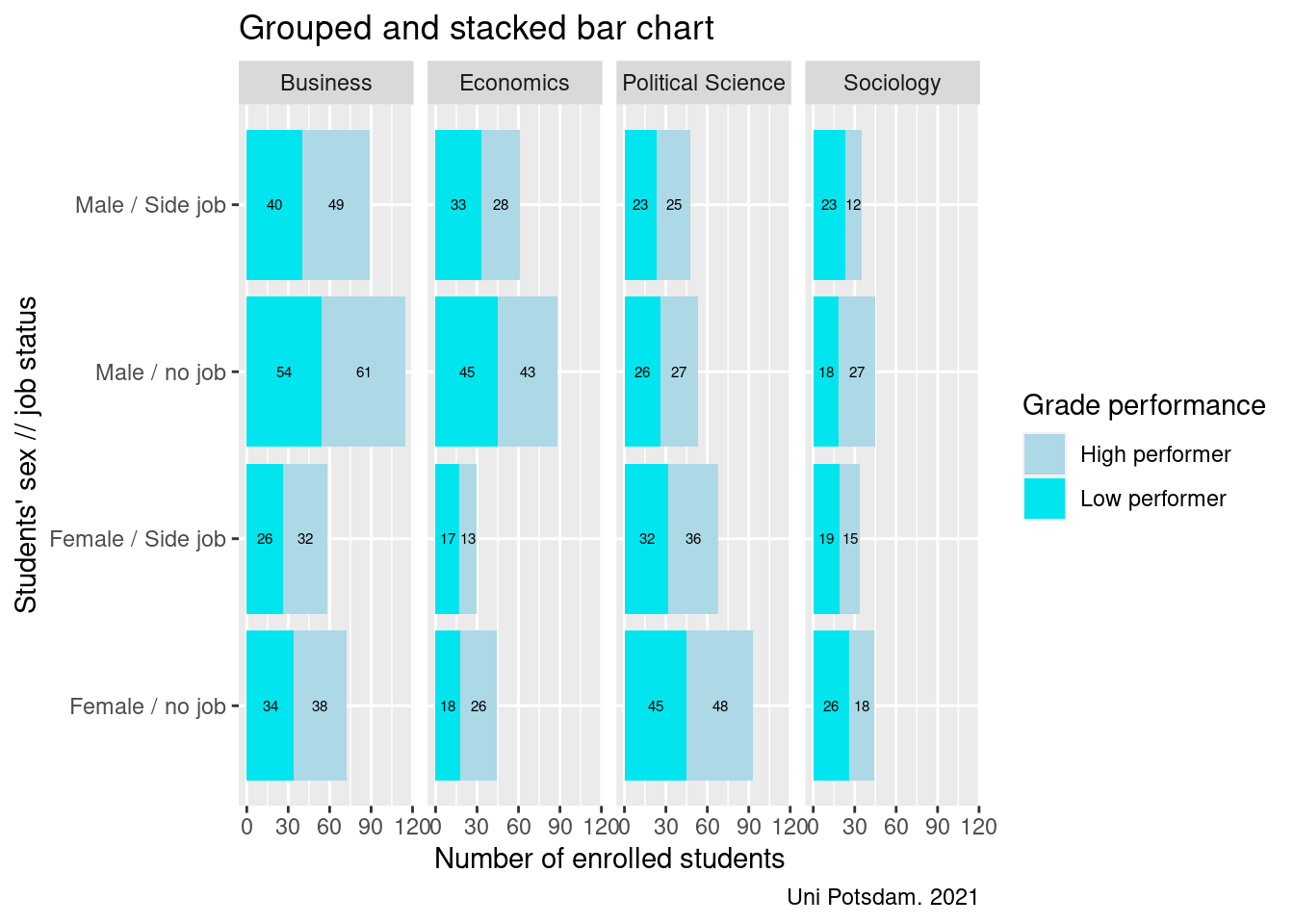
8.4 Funky Graphs
In this section, I would like to speak to your artistic side and show you three more exotic graphs that you come across less in daily life but wish you would see more.
These examples also show the power of R graphics. These graphs would be quite difficult if not impossible to produce with other software like Stata or SPSS.
Note that you can do a lot with built-in ggplot() functions,
however, some of the below visuals require additional packages that you
need to install and load using – as always – install.packages()
and library(). This illustrates another strength of R – its
collective community capacity. If something does not exist, be sure that
somebody is probably working in it and allowing the community to use it.
8.4.1 Alluvial Plot
Alluvial plots are great to visualize transitions by group. Imagine we had data on where students worked after they completed university. We could then plot how many students from each department went into which career. We don’t have that data. Instead, we are going to look at whether male or female students differ in terms of which faculty they attend.
First, install the “galluvial” package and load it. Then create a
dataset containing what you want to visualize, in our case, number of
observations by faculty and sex. Note that the syntax in ggplot()
changes – you now have to define axis1 and axis2. You then use
geom_alluvium(aes()) to define the plot. The rest are options that
change the look of the graphics but are not too important here
If you like alluvial plots explore other ways to produce them including using the alluvial package, easyalluvial package
# Alluvial plot
# install package using install.packages("ggalluvial") and load it
library("ggalluvial")

alluvial <- students %>% filter(!is.na(sex), !is.na(faculty)) %>%
  group_by(sex, faculty) %>%
  summarise(obs = n()) %>%
  ggplot(aes(y = obs, axis1 = sex, axis2 = faculty)) +
  geom_alluvium(aes(fill = sex), width = 0,
                knot.pos = 0, reverse = FALSE) +
  geom_stratum(width = 1/12, reverse = FALSE) +
  geom_label(stat = "stratum",
             aes(label = after_stat(stratum), vjust=-3)) +
  scale_x_discrete(limits = c("Sex", "Faculty"),
                   expand = c(.05, .05)) +
  scale_fill_brewer(type = "qual", palette = "Set1") +
  ggtitle("Alluvial plot")

alluvial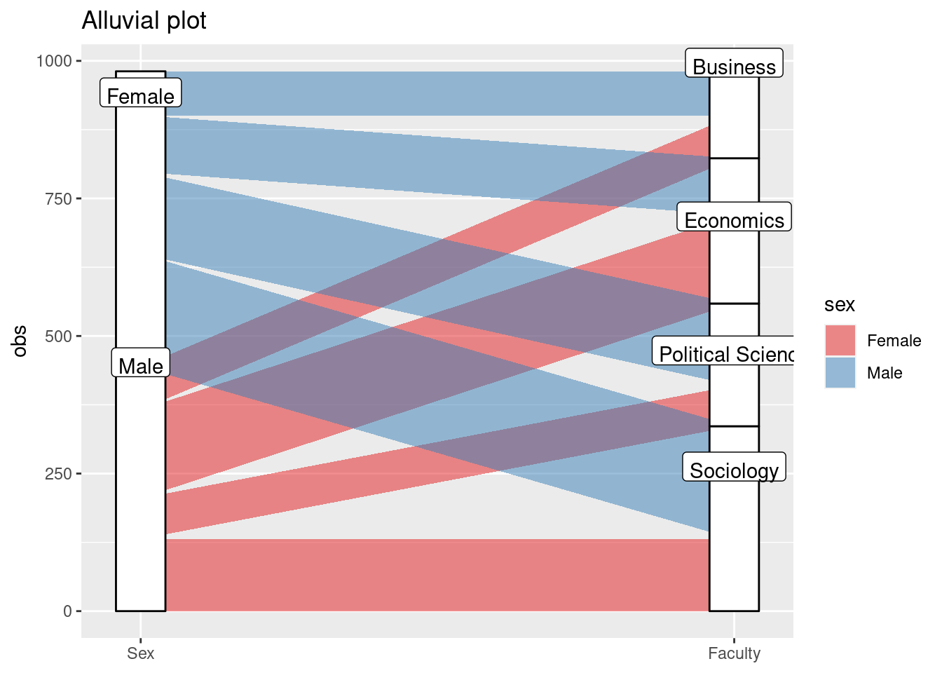
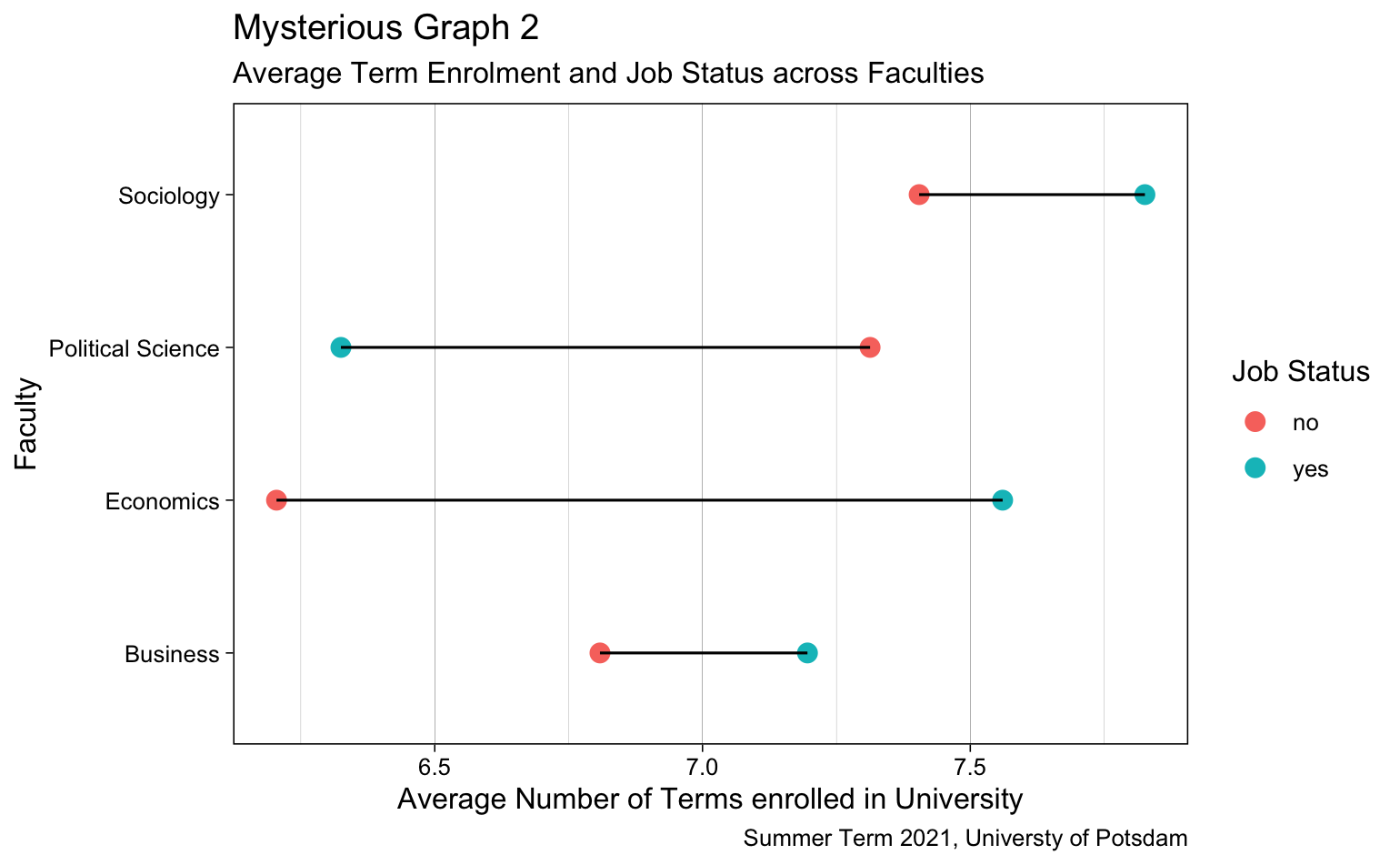
8.4.2 Lollipop Graph (Cleveland Dot Plot)
The lollipop plotBis basically a bar chart, where the bar is transformed in a line and a dot. It shows the relationship between a numeric and a categorical variable. It is called lollipop because it has a little bubble at the end of the line.
I am going to show you the Cleveland Dot Plot – a variation of the lollipop plot that lets you compare two groups.
There are different ways to do this (also see geom_segment()). We
will make it simple: A Cleveland Dot Plot is basically a bar chart
flipped on the side , with dots instead of bars and a line connecting
two groups.
First, we install the “hrbrthemes” package and load it. We also import
some fonts we need using a function that is provided by the package:
hrbrthemes::import_roboto_condensed().
We use geom_point() and then geom_line() to plot a line
between the dots for male and female students. Then we also use a new
theme which is provided by the new package.
The plot shows the average grade in every course by sex. We can now easily see where female students outperform male students and the other way around.
Note: If you receive an error notification that “titillium web cannot be found,” download the font family here and restart R Studio.
# load and install new package
# install.packages("remotes")
# install.packages("gcookbook")
# install.packages("hrbrthemes")
#-> see https://github.com/hrbrmstr/hrbrthemes
library(hrbrthemes)
library(gcookbook)
library(remotes)
# get fonts
hrbrthemes::import_roboto_condensed()# Plot
lolli <- students %>%
pivot_longer(starts_with("gpa"), names_to="year", values_to="gpa") %>%
group_by(course, sex) %>%
summarise(gpa = mean(as.numeric(gpa), na.rm = TRUE),
gpa = round(gpa, 1)) %>%
na.omit() %>%
ggplot(aes(x=gpa, y= (course))) +
geom_point(size = 3, aes(colour = sex)) +
geom_line(aes(group=course)) +
theme_ipsum_tw() +
theme(panel.grid.major.y = element_blank()) # No horizontal grid lines
lolli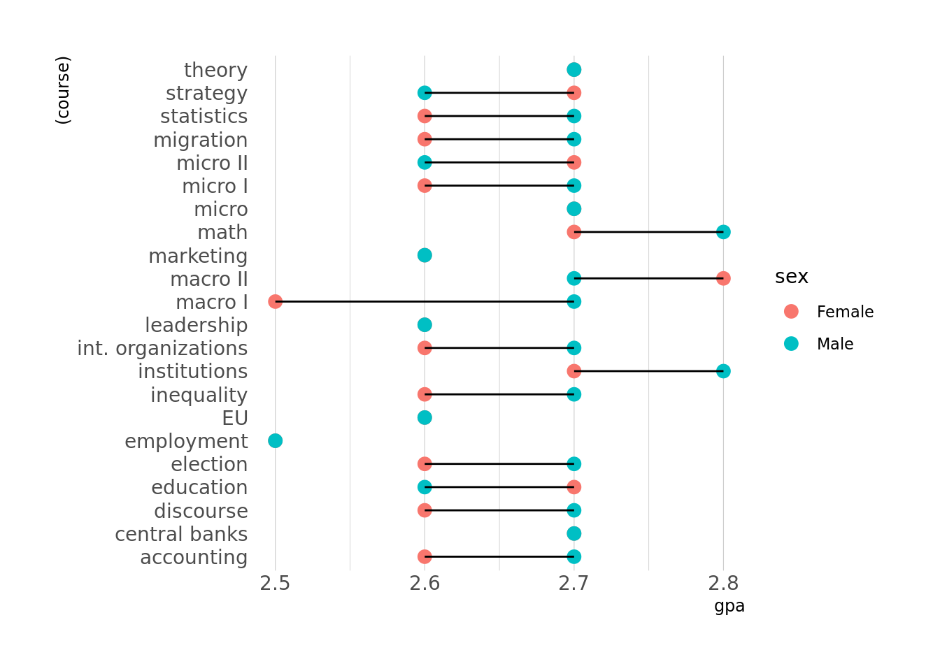
8.4.3 Ridgeline
The ridgeline
plotB allows
to study the distribution of a numeric variable for several groups.
Again, we need another package to do the magic. Install and load the
“ggridges” package. It contains new functions that we apply to produce
the plot incl. geom_density_ridges() and theme_ridges().
The first attempt already looks interesting. However, we want some
further adjustments. The second attempt filters out missing values, it
changes the order in which the density plots appear (using
fct_reorder()). Also, we want an even cooler look. Each wave should
have the same color but change color intensity within each wave as the
values on the x axis increase. To do that we install the “viridis”
package and use geom_density_ridges_gradient() and the
scale_fill_viridis() function. Also, now we need to add a
fill= argument to ggplot().
# ridgeline
# install package using install.packages("ggridges") and load it
library(ggridges)

ridge <- students %>%
  mutate(like= as.numeric(like),
         course = fct_reorder(course, like)) %>%
  ggplot(aes(x = like, y = course, fill = course)) +
    geom_density_ridges() +
    theme_ridges() +
    theme(legend.position = "none")

ridge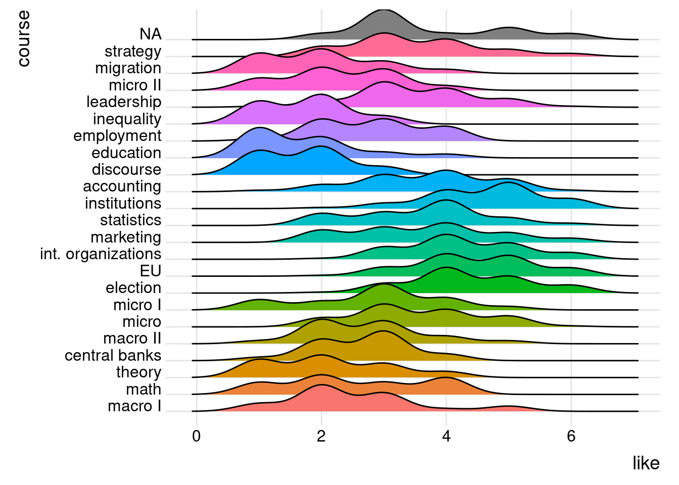
# change coloring and order
# install package using install.packages("viridis") and load it

library(viridis)

ridge <- students %>%
  mutate(like= as.numeric(like),
         course = as.factor(course)) %>%
  filter(!is.na(course), !is.na(like)) %>%
  ggplot(aes(x = like, y = reorder(course, like), fill = ..x..)) +
  geom_density_ridges_gradient(scale = 3, rel_min_height = 0.01) +
  scale_fill_viridis() +
  labs(title = "How much students like their course?") +
  xlab("Liking the course (1-6)") +
  ylab("Course enrollment") +
  theme_ipsum() +
  theme(
    legend.position="none",
    panel.spacing = unit(0.1, "lines"),
    strip.text.x = element_text(size = 8)
  )

ridge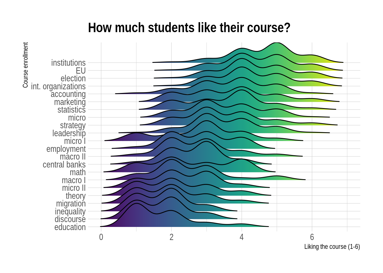
8.5 Exercises I (based on class data)
Last week, you produced some relatively easy graphs. But this week is different. Why? Because the Board of Education has requested you share your findings, after your employer boasted about your abilities. This is the perfect opportunity to go find a new job! In other words, this time you will focus on making your graphs even prettier! We will produce in total three graphs together.
The first graph shows the relationship between the faculty, the number of enrolled students and the student type in the form of a grouped and stacked bar chart.
First, you have to create a student type. Let’s look at the number of terms for that purpose. Come up with a categorization system. An example could be: newbie, moderate, perpetual student. Maybe combine info from other variables and create a variable for students that are single and working-class or have a job and a relationship. It is up to you! Please limit your categories to 4 types.
We do not want any NA in our dataset, so please filter them out.
Make sure to get the counts of students per faculty and your newly created student type.
Do not forget to make it pretty and to add labels!
The second graph revolves around the relationship status and the faculty in the form of an alluvial plot.
First, get rid of any NA.
Now it is time to create counts of students (Hint: rows) by the relationship status and faculty membership.
Do not forget to make your graph pretty and to add labels!
The last graphs depict 1) the relationship between the faculty of choice and the course satisfaction, and 2) the relationship between the faculty of choice and the number of terms. Both are to be presented in the form of a ridgeline plot.
For both plots, you will need to make sure that the data of interest is of the appropriate data type. (Hint:
as.numeric()is useful here.)Do not forget to exclude NA data.
Make sure to make your graphs look pretty and have labels!
Rather than telling what we want, we will show you a graph and you should replicate it with R code. Below, you find images of two plots. Select one of them and give it a go!
8.6 Exercises II (based on your own data)
Revisit your individually chosen dataset. We will not provide further details as to how to configure your plots in this week since you can be considered intermediate R programmers now. In other words, you are free to visualize the data in the two plots as you like, but we will be disappointed if it is not pretty and if it does involve less than three variables. Find suitable data to produce two graphs:
A scatterplot.
A lollipop plot.